Showing posts with label art. Show all posts

Saturday, 25 April 2020

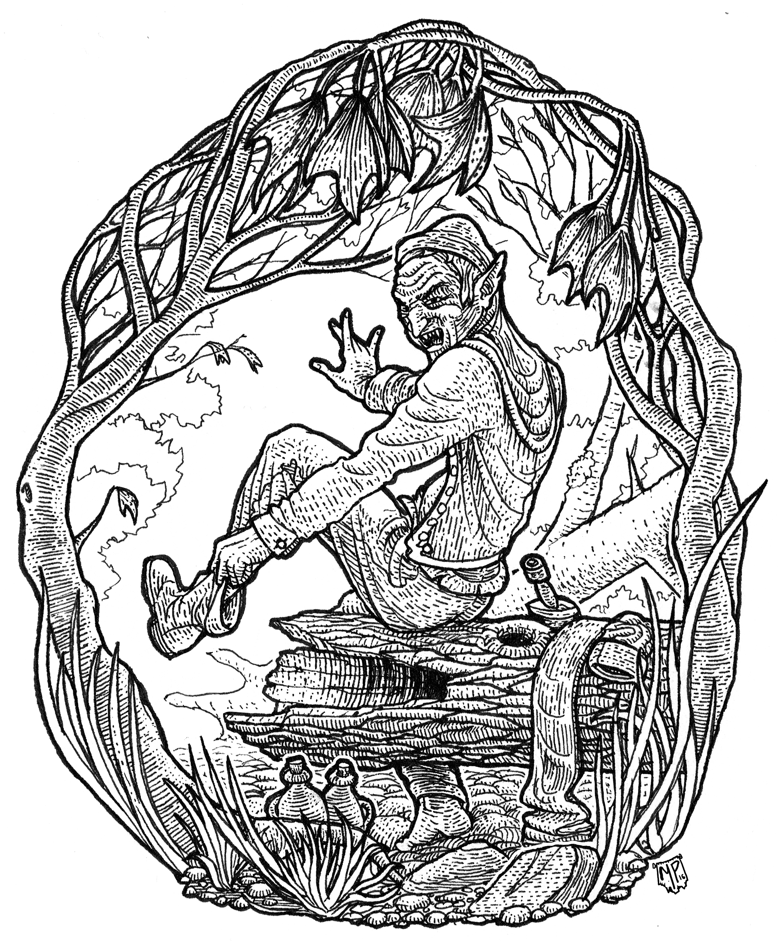
Bestiary Illustrations

Just a short note to say that I'm still here, scratching away at bestiary illustrations!

This block, above, shows:

  • Dream Eater
  • The God Unmnoving
  • Leádstæf Werewolf
  • Shrine Babies
  • Heilian Gorgon
  • Sand Sprites
  • Whip Scorpion
  • Ghost Selk

I have one last one to complete before I can finalize the PDF and order my test print from DriveThruRPG.

For whatever reason, I found some of these so intimidating to even start that I found myself occasionally blocked. I did find something to help: adding a column to my tracking spreadsheet to represent how much effort I thought each piece would be.

Size is one factor, because of all those little shading lines (particularly if there's a lot of darkness, or light gradients on a stone wall), but humanoid figures (and especially faces) are tricky. This helped me keep going, as I could pick off an "easy" one from my list at times when I didn't feel so on the ball.


What makes me laugh in retrospect is that I was way off on many of them. Once I get going, I sometimes turn a simple concept into something tricky (for me) to execute. The chart-topping "Ghost Selk" was so hard because I wanted both a compelling concept, and I had originally planned to do a close-in portrait.

In hindsight, the toughest one was probably the Sand Sprites, because it does have a portrait, required some perspective fiddling to get the well looking right, and is a full-page illustration with lots of shadow.

I'm about to do that with the Hungry Spirit picture, the last one remaining—I had thought it would be some hazy ghostly outlines, but I have something a bit more ambitious in mind now that I'm right at the finish line!

Sunday, 24 November 2019

Limiting Ink Density

If you're printing at Lightning Source, e.g. because you're doing a POD product at DriveThruRPG, you have to abide by LS's printing specifications. One of those is a so-called "ink density limit."

What is an ink density limit, and how do you stay within it?

As I wrote in the last post, printing presses use four colors of ink to replicate the colors in your digital files, cyan, magenta, yellow, and black.. CMYK. Most colors are reproduced using a combination of multiple inks. Darker colors need more ink, as do more saturated colors.

For especially deep, saturated colors like inky maroons or really dark, muddy greens, you can need quite a lot of ink - black, yellow, and magenta. Just like coloring over the same spot over and over again with a marker, too much ink can wrinkle the paper, or cause smudging and bleeding before the ink has had time to dry.

For this reason, Lightning Source imposes a blanket restriction on the total amount of ink any one spot on the paper can take, to 240%. Their darkest, richest black allowable is achieved by 100% black ink, with 60% cyan, 40% magenta, and 40% yellow.

Do we have a problem?

Waiting for Lightning Source to tell you that you have an ink density problem is going to ratchet up your turnaround time. It takes several days for DTRPG and Lightning Source together to check, process and then reject your PDF. Better to check it yourself.

The best way to check I've found so far isn't great, as you have to skim your whole document by hand in InDesign. Even so, it beats losing half a week to turnaround time.

Open up the so-called 'Separations Preview' panel, in the menu: Window | Separations Preview.

(It's called that, because it's a preview of how your document colors will be separated into the four different inks.)

Turn the 'View' to 'Ink Limit', and then change the numeric value to '240%', like so:


This causes your document to be re-rendered in a washed-out gray, but with any areas that violate the 240% limit picked out in red.

For example, here's an ink-heavy map from my compendium in the normal view:


Here's how it looks with the Ink Density limit preview on:


If you click on that to zoom in you can see a few areas have been called out by InDesign as busting the ink density limit.

Why those areas? There are some dark, muddy browns there - they're close to gray but not exactly gray, which means you need a combination of cyan, magenta, and yellow to reproduce them on paper. They're also really dark, which means a bunch of black ink goes on as well. Soggy.

InDesign doesn't seem to have any sort of whole-document pre-flight check for ink density, which means there's no simple way to find these problems without scanning the whole document. (If you know of one, let me know!)

Checking Ink Density in Photoshop

Unfortunately, Photoshop only allows you to check a single pixel at a time. Open up the Info panel, and click the eye droppers to change its display options. You want to see the CMYK color, and Total Ink views.


As you mouse around your image, Photoshop will show you the total ink density. This isn't really useful for finding problems, but it's a decent way to check that you have fixed them. (See below.)

Fixing Ink Density

Fixing ink density problems can be tricky for indie publishers, particularly if the publisher/artist roles are played by separate people and the publisher only has InDesign, and the artist only has Photoshop.

If you're the publisher:

  1. You may need to explain to the artist what ink density is, and how to spot check it.
  2. Send the artist a screenshot of the ink density view from InDesign, so they can see the problem areas.

If you're the artist:

  1. Learn what ink density is, and how to spot check it.
  2. Find out from your publisher what the problem areas of the image are, so you can check them out
  3. Keep your original art piece separate, because many of the methods of fixing ink density are destructive, making permanent changes to the art.

Method 1: Tweak the image

This involves some trial and error, but some combination of level adjustments, curves, and desaturating dark colors can fix ink density problems. This may keep you in your comfort zone, but it strikes me as a little haphazard for two reasons:
  • Photoshop doesn't seem to have any built-in adjustments that target ink density. Because density is a subtle combination of high saturation and low brightness, there's no blend mode or levels solution that's a guaranteed fix that won't wash out the image (as far as I can tell).
  • Checking your work isn't isn't easy, because you can only check one pixel at a time. By the time you've fixed the problems, but then re-adjusted so your image isn't washed out, you might have caused new problems elsewhere.
I welcome tips or links to articles about this approach.

Method 2: Convert to the printer's recommended color profile

Converting to some specially designed color profiles seems to fix ink limits.. sometimes.

For this method, you should probably learn what color profiles are so you have some idea of what's happening.

Applying the profile is easy (once it's installed). In Photoshop, use Edit | Convert to Profile, and pick the printer's profile.

A key limitation of this approach is that ink density limits are not a feature of color profiles. Reducing the ink density can be a side effect of a profile conversion, but there's nothing in the profile that sits there as an ongoing safeguard against ink density problems.

Photoshop does its best, but if you have any layers in the multiply blend mode, while each layer individually might respect ink density limits, the resulting final pixels can still blow past the limits.

For this reason, if you rely on a color profile conversion to fix ink density you should:
  • Flatten the image first (to get rid of blending mode interactions)
  • Limit the amount of adjusting you do afterwards, e.g. fixing the contrast
  • Spot check problem areas before you declare victory
Currently, DriveThruRPG is recommending that art be converted to the CGATS21_CRPC1.icc profile, which you can download from them.

Method 3: Convert to custom CMYK profile settings

If you can't figure out the printer's target color profile, Photoshop will let you manually specify an ink density limit if you convert to a 'custom' CMYK profile.

Choose Edit | Convert to Profile..


Chose the CMYK destination space, then pick 'Custom CMYK' as the profile. When the profile customization dialog pops up, type in '240' as the ink density limit:


..and that's it.

Finally, spot check any problem areas your publisher highlighted for you, and any other likely problem areas if you do any adjustments after the conversion.

As with using the printer's color profile, there's nothing magical about converting to CMYK that will keep your image within the ink density limit if you adjust it. It may already be out of whack if you have blend mode interactions, so try this with a flattened version of the image if your spot checks.

Send it back to the publisher and.. good luck!

Friday, 24 August 2018

Lost Lair of Lorethain Sharr

I wanted to support the One Page Dungeon Contest this year, and Luka Reject hit upon the perfect method—offer an illustration as a prize!

It was a bunch of work to comb through the entries to find one that could benefit from a map, but yet was clear enough—and interesting enough—to illustrate well. It made me respect the judges all the more, as they had a mighty pile to go through indeed!


In the end, I selected Jeremy DS Marshall's Lost Lair of Lorethain Sharr, mainly because of its clarity and richness—it's chock full of things to draw. Enjoy!

Thursday, 5 April 2018

Isometric Circular Stairs

I've put together a tutorial for one of the more brain-boggling aspects of isometric dungeon drawing, circular stairs.


If you're just watching it to see that it can be done, enjoy—but if you're watching to actually do this and draw some, definitely watch the (less exciting) video on how to draw isometric circles. Circular stairs are (no surprise!) riddled with circles and bits of circles.

Monday, 30 October 2017

Narwhal Part 3


Next step, making the harness. As with the centaur, I used aluminum straps. You can bend them by hand, and with self-tapping screws, they're very easy to join with one another.

Getting the shape of the shoulder strap is surprisingly hard, and requires a very patient wearer.


Note of caution: big suits like this that are held up by small harnesses can produce a lot of leverage. If a boisterous kid slams the wearer, or if the wearer falls down (e.g. some porch steps while trick or treating), the full force is going to jab them with the harness.


If you look carefully, there's a really dangerous design element in this harness: the bottom tip, which has the potential to dig in like a can opener, if (for example) the narwhal takes a blow to the forehead. I addressed this by adding a long strap vertically, which holds the tail.

Still, a better design would be to add a horizontal piece across the buttocks to prevent any force hitting the spine at all.


Once the harness is in place, I add another bent piece of metal for the lower 'jaw bone'.


Next step is to start draping. You can more or less take fabric, drape it over the foam body, and cut it along the seams.


Here I'm cutting out a 'dart' from end of the tail so it will join up nicely without wrinkling, as shown in the next image:


This takes a while for something this large, but I used the same technique everywhere. When you sew it together, it's inside-out (so the seams wind up inside). This makes it almost impossible to keep track of where you are. I find I have to label it with bits of tape so I can make sense of the limp octopus-like tangle of fabric at the sewing table.


Here it is, with all the main body drapery done! We're going to make the eyes black, but it's just pinned in place for now to get the placement.


L is determined to trick-or-treat for hours and hours, so I've cut arm holes in the front, along with little sleeves cinched with elastic:


Once L mastered the glue gun, she wanted to do all the gluing. Here she is working on attaching the front fins.


This is the current state. Lots more to do, especially around the mouth and flippers!


Wednesday, 22 February 2017

Isometric Dungeon #5 - Cavern Waterfall

Here's a fifth video in my isometric dungeon drawing series, a cavern waterfall.


This time it's a cavern waterfall. I don't say much, although I had fun with the audio regardless. Happy to take requests - what has stumped or intimidated you in the past?

Sunday, 1 January 2017

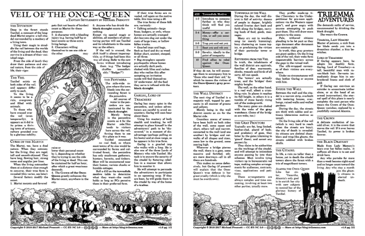
Veil of the Once-Queen

Deep in the forest is the citadel of Tanibel, once the capital of Martoi. Although their time has passed, they have found a way to cling to the world by straddling the veil between life and death.


In my home campaign, the three Lords of Tanibel have ridden out and poisoned entire watersheds with the black draught, leading to the terrible undoing of society hinted at in the Unmended Way.

Even if you don't go quite so apocalyptic and campaign-defining, Tanibel is still easy to slot into any forested region of your campaign world. Treat the Martoi like a fey court with a particular obsession with treachery.


The gray proctors are probably my favorite part of this one, if players haven't figured out what's going on with the veil by the time they get to the gates, I think there's potential for a truly horrible realization.

Saturday, 10 December 2016

Which Way to the Sun?

File this under "perspective is weird". Last summer on a camping trip, we were stargazing just after sunset. I remarked howbizarrely—the lit region of the moon appeared to point above the horizon, despite the fact the sun was below the horizon.


What the heck is happening?

A recent blog post by Randall Munroe (which I can't find right now) asserted this was impossible, which made me question my memory.  I have, however, just seen precisely the same phenomenon tonight, which makes me confident it's a real thing and perspective is just plain weird.

Here's a couple of stills out of a video I shot to prove it.  Some things to notice:

1. The moon is way higher in the sky than the sun is. (The moon is perhaps 30 degrees above the horizon, the sun is setting.)

2. Nevertheless, the lit portion of the moon is the upper right quadrant.

3. Without any other markers to suggest what's going on, this is pretty weird.


Fortunately, there are some other markers I didn't realize until I was annotating the photographs: the horizontal lines on the long hardware store that appears in both images.

In the first picture, the roof lines appear to go "up" to the west, in the direction of the sun, but in the second picture, they go back down again. In fact, the horizontal roof line in the first image makes it clear that it's not really the "upper" portion of the moon that's lit at all: the line to the sun is straight south, following the roof line. It's just that in that linear perspective, horizontal lines which are above you appear to go "up" as you get to the edge of your field of view.

Since we're "below" the moon (at least from my Earthen reference point) we can see the partially unlit 'bottom' of the moon and none of its partially unlit "top".

The root error in thinking this scenario is possible is assuming that these lines are straight. You'd actually need a fish-eye lens to see both at the same time, which would force "straight" lines to be curved:


Thursday, 1 December 2016

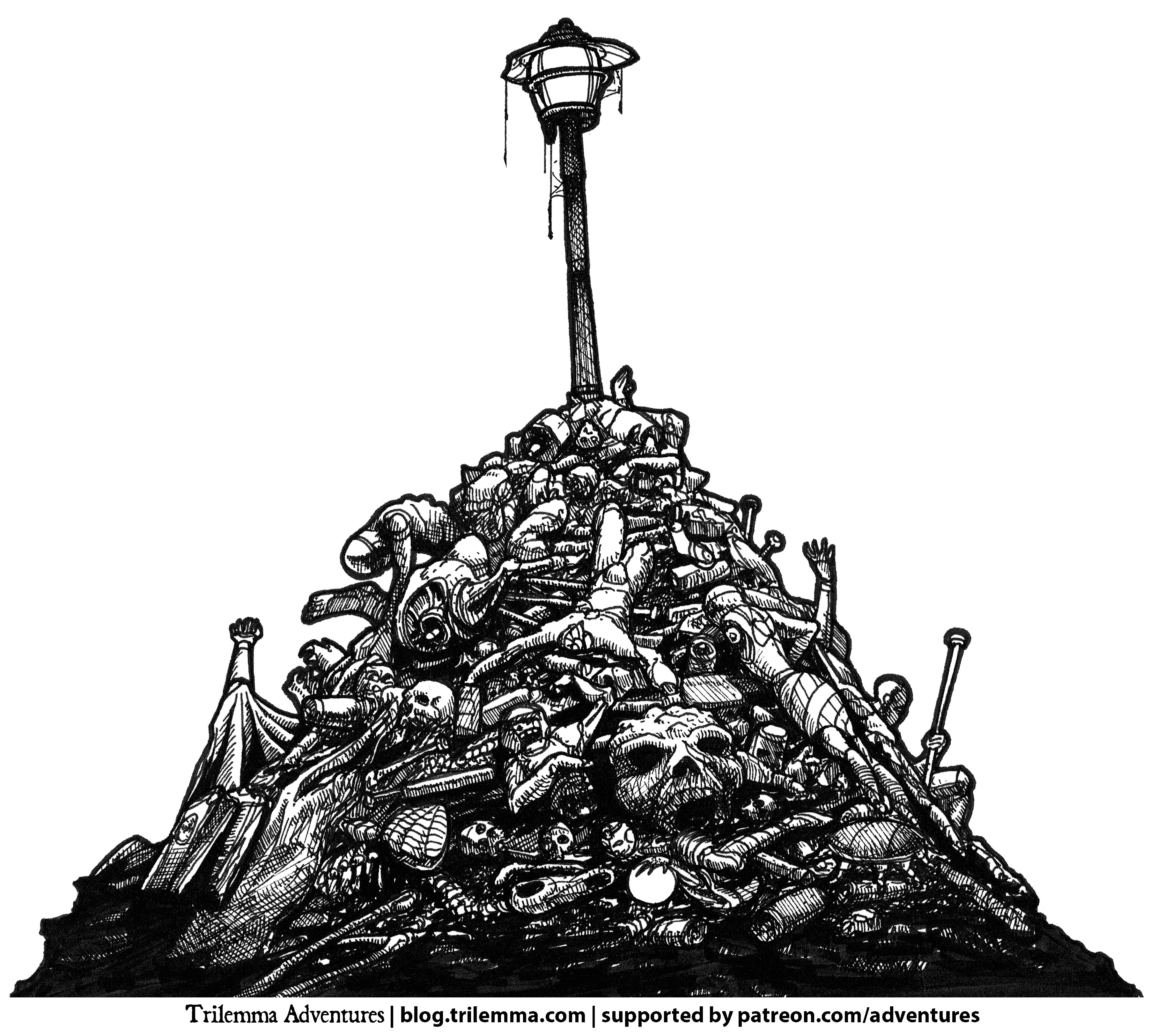
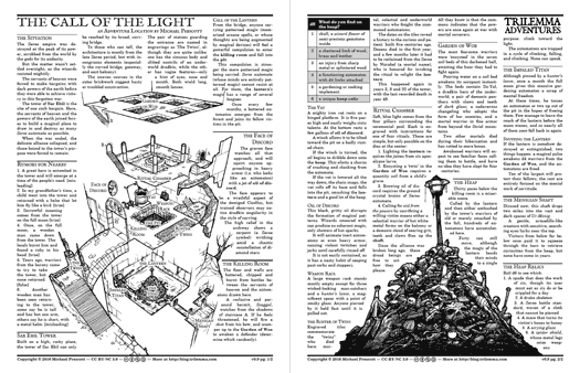
The Call of the Light

As some of the others have done, this adventure started out as a stubborn visual I couldn't get out of my mind: a massive heap of automaton parts under the baleful light of a lamppost.


What brought them there? Why, the call of the light.


As always, thanks to my generous patrons, the art and text for this month's adventures are free for non-commercial use under the CC-BY-NC creative commons license. Enjoy!

Thursday, 24 November 2016

Isometric Dungeon Tutorial #3 - Village Well

Short little post today to point people to a third isometric drawing tutorial, this time a village well.

After a long dry spell of suffering with OS-basis video editing, I'm back to using a real editor, so I can make the whole thing go by much faster, while still stopping to call out a few things I've breezed by in the past, notably freehand circles.


Saturday, 10 September 2016

Isometric Tutorial Videos

I've started a series of isometric tutorial videos, showing how I draw various pieces of dungeon architecture. So far I've done some stairs and a set of arched double doors.


I'm using graph paper from Incompetech, specifically the "isodots", with the dots set to light blue. Using cyan dots lets me pull them out easily with Photoshop (using a black and white adjustment layer with the cyan slider set all the way to white).


The basic points I cover are:

  • block out the 3D space the object is going to occupy
  • ensure you're rigorously following the isometric lines - all drawings are flat, so this is important to reinforce the impression of three-dimensionality
  • finding points in 3D space often happens by finding the intersection between a vertical and a horizontal line (as with the stair creases)
  • texture adds character, but must also follow the isometric axes or you'll quickly spoil the 3D impression
  • circles are tricky - as with other shapes, first draw the square tht the square that the circle occupies, then draw it as four separate arcs
  • draw your objects from the front of your dungeon to the back so you don't accidentally
  • draw in pencil first (ideally blue, so you can use the same PS trick to remove it without having to erase)
  • use a waterproof pen, so you don't smudge your ink
  • use thicker lines to indicate depth changes between objects
Hope it's useful!

Friday, 11 March 2016

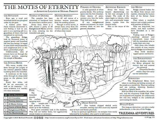
The Motes of Eternity

This adventure heads into the steaming jungles of South Wyv, a lush, volcanic peninsula.

River travel being much easier than hacking your way through the jungle, it's most likely that the players will encounter Nulga's cave first. This is one of the possible hooks - Nulga knows a lot about wizards and their ways. His knowledge might even be the players' goal.

Dendra knows a lot, too - in particular about the ancient world and its deepest magics. But talking to her should feel like going to a serial killer for advice. She honestly believes that the gods are wayward, primal impulses to be avoided, and the best course of action is to flout their intentions as flagrantly as possible. (She knows nothing about more recent demigods like Cicollus or Deel.)

The unearthing of her temple will have been noticed by sensitives a long way away. She has no expansionist agenda, but her message will appeal to the worst sorts of people.

The Motes are a new people, but avoid playing them as rubes. They've had to learn quickly in a dangerous environment, and they've been the first ones to recognize Nulga's well-meaning guidance is out of touch with the challenges they face. Dendra has exploited this, to make her point, and doesn't truly care whether the motes live or die.

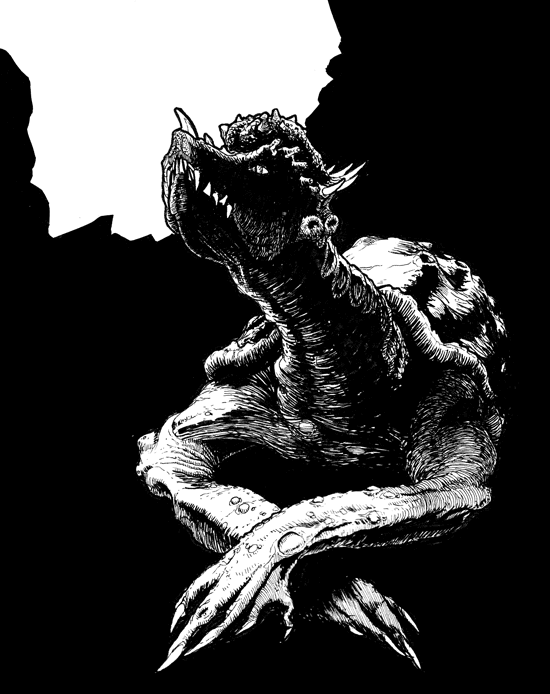
The Void Gulls around the river system are lost, and not an organized threat, but it's their frantic attempts to escape that have exposed the long-buried Pyramid of Dendra.  Their shatterwisping, and possibly fragments of the dread scepter are the most useful "treasures".


Here are the art pieces, released for reuse under CC-BY-NC.


Friday, 9 October 2015

Making a 3D Map, Part 3

It's finally done! This has probably been the largest, most complicated traditionally-drawn map I've done so far.

As explained in previous posts, I don't have a scanner large enough for me to draw this at the size I wanted to work, so I decided to work piecemeal, scanning each section as I completed it, then reprinting it in cyan on card stock.

The cyan could all be all removed in Photoshop, leaving me with a mosaic of pieces to assemble.


"The old wizard hands you a map in four sections, apologizing about the size of his scanner."
I'm pretty psyched about how it turned out.  Here's the final, assembled map:

click to embiggen

To get it at proper viewing size, you'll need to check out Bedrock Games' upcoming Wuxia RPG, Wandering Heroes of Ogre Gate!


Thursday, 1 October 2015

Making a 3D Map, Part 2

With my trusty cyan maquette and my PITT pens, I've been slowly adding ink to the Tomb of the Timeless Master.  There are quite a few rooms, so I've annotated my SketchUp drawing with notes cribbed from the module.


At this point I'm grateful for the copious perspective-reference lines I sprinkled all over the maquette. For irregular structures like rocky cliff faces (which are really just scraggly lines), it's really easy to destroy the sense of perspective without constant reminders of the 3D space they're filling.


Once I've filled the page, I scan it into Photoshop to use its magic to pull out the blue lines, and clean off any crud.


To add more to the illustration, however, I add a blue gradient map, so that I can use what I've completed so far as a structure to attach the rest to.


Time to stock up on cyan printer cartridges!


Monday, 28 September 2015

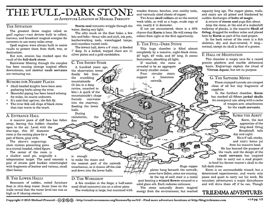
The Full-Dark Stone

Great as they were, the Seree wizards of old would never have been able to cast their most powerful magics using talent alone. Still lying around the realm are their spell vaults, tomb-like fortifications that hold the secrets of their magical supremacy.

The Seree are gone, but the vaults remain. But the gnawing of time cares nothing for secrets..


On the big map, the vault is located in the foothills of the Wintpeaks, north of Aridenn, but you could situate it in any mountain or escarpment. Relatively close to an existing settlement is better, since that gives a greater chance that there are some 'river people' encountering the vault servants, or exhibiting odd, magical side-effects from the vault's runoff water.

There's very little loose treasure in the vault, but remember that nearly every skull contains a wizard flower!

Vitrum Aquae for Player Characters

If PC spellcasters experiment with the vitrum aquae ritual, it's basically an opportunity for a permanently-memorized spell (which uses up the spell memorization slot), at the cost of a point of one or all of Int, Wis, Cha.

The quantity and quality of gemstone should be commensurate with the level of the spell being crystallized - anything less will worsen the side effects, which include:
  • Losing more points from Int, Wis or Cha
  • The spell uses up one or more additional spell slots
  • The spell is miscast, and can never again be cast in its correct form, and always comes with either minor or major side effects (e.g. fireball always detonates at the wizard's fingertip, invisibility can only be cast on someone else, levitation only works upwards, the wizard can never fly to the east, etc.)

Art Files

Thanks again to everyone supporting this project on Patreon! Thanks to their generosity, everything in the adventure is released under cc-by-nc, so you can pull it apart and remix it for whatever non-commercial purpose strikes your fancy.

Tuesday, 22 September 2015

Making a 3D Map, Part 1

I'm doing another 3D map for Bedrock Games, and figured I'd show the process I'm using here.

As usual when I do maps for +Brendan Davis, he showers me with sketches, documentation and reference images to help me out. It can be a lot to read at times, but it comes in handy when doing 'dungeon dressing'.

In this case, we're doing the Tomb of the Timeless Master, an adventure location for the upcoming Wandering Heroes of Ogre Gate wuxia RPG. It's got a lot of vertical elements - great for isometric or other 3D maps.

Here's part of the sketch Brendan sent me:


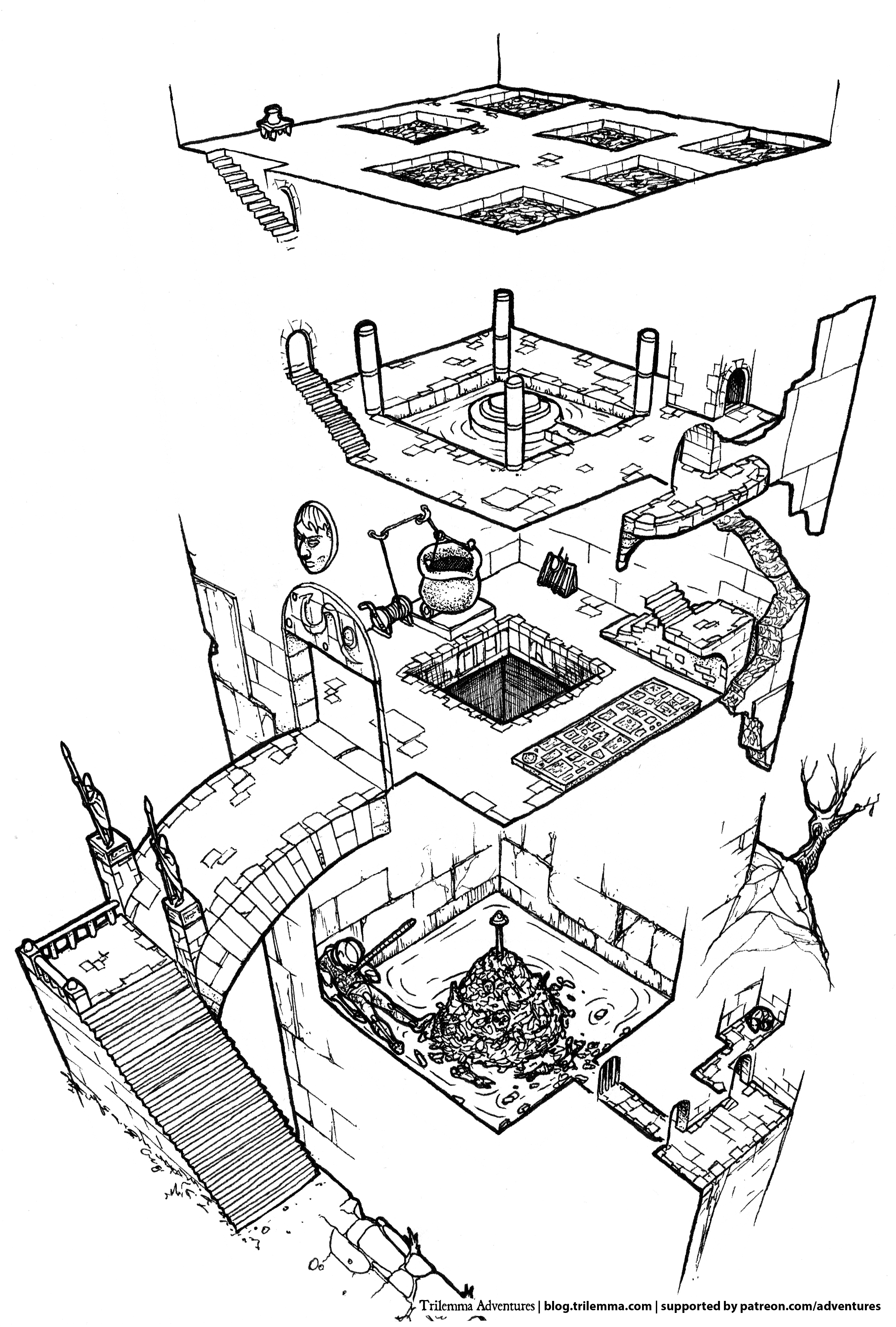
After a bit of back and forth, I knew the altitude of everything, which way the stairs climbed and so on, so I could start thinking about one of the big challenges of doing a 3D map: which angle do you pick to draw it from?

Sometimes you're rendering a location that follows Q*Bert topology. That makes the decision easy: you draw the dungeon from the angle that makes it more or less co-planar with the surface of the paper.

3D Maquettes to the Rescue

Some dungeons just aren't that simple, however, and the Tomb of the Timeless Master is one of them. After staring at it for a while, I realized the only way I was going to figure it out was to play with an actual 3D model of the dungeon.  Time to bust out SketchUp!

One of the great features of SketchUp is that you can import a 2D image to use as a reference. Below, you can see Brendan's original sketch.  I've traced the rooms, then lifted them vertically to the correct height.  Before long, I had a little 3D maquette to experiment with.


This let me rotate the model this way and that, looking for the angle that presents the dungeon in an interesting way, and with the least number overlapping elements. Some more discussion with Brendan helped here, as he decided to collapse a few stray bits to help it read as clearly as possible.

Cyan Is Your Friend

How to get from here to an illustration? I like to draw at an exaggerated scale, because that helps with the detail. Unfortunately I only have a letter-width printer and scanner.  I decided to do what I did on a previous illustration: to draw it piecemeal, and assemble it digitally.

To this end, I needed a template to make sure that all the pieces fit together properly.  The basic idea is this: print out a reference in non-photocopy blue, draw it, scan it in again, and pull out the blue using Photoshop, leaving a clean illustration for me to assemble.

With a few tweaks to my SketchUp settings, then a bit of adjusting in Photoshop, I had my template.


As you might be able to tell, I've actually decided to go with a 3D perspective rendering, not isometric at all. SketchUp makes this easy, and 

Working as a mosaic, however, means stitching together pieces of the illustration. Fortunately, the same technique I'm using for the template can work here, too. Where the pieces need to overlap, I can actually just print out the "seams" in blue, connect them by hand, and scan them in again.

Pull out the blue and I'm left with just the new, hand-drawn connection piece (in black), which fits like a puzzle piece with the two halves of the illustration I'm connecting:


Above, you can see part of the chapter heading illustration from the same book. This image appears in a few variations, which required me to join up a few "alternate" pieces of the illustration.  The woman on the left appears in two different poses, but she needs to connect to the same piece of scarf.

Stay tuned, I'll post the map once it's done!

Tuesday, 28 July 2015

Quick & Dirty AW-Style Character Art

One of Apocalypse World's iconic features is the stark, black and white character art in each playbook.

There are lots of ways to produce this sort of stuff, some requiring more talent than others, but here's is a relatively low-skill way to use Photoshop to producing vaguely similar-looking images.

(One of the things I like about it is that, with the exception of one step, it's all dynamic. I'm a big fan of adjustable, reversible steps that I can come back and tweak later. Running a series of filters and baking it all into a single layer just feels wrong to me.)

First, find a suitable original photo (which you have rights to, obv.). This is just a photo I snagged off the web, which means this man will presumably track me down and kill me at some point.


Chuck this into Photoshop, as the bottom layer.  Above it, add a Threshold Adjustment Layer, which will make the image look like this:


Tweak the threshold value (from 0-255) until you find a setting that you like.

One thing you'll notice is that (depending on your source photo), you may be looking at a lot of detail, with little 'crumbs' everywhere.  A simple way to chop this down is to make a copy of your photo (above the original) and then use the Gaussian Blur filter.

With the blur filter's preview feature turned on, you can see the effect it'll have on your image before you commit. (This is the one non-dynamic step in this process.)


Next, I chop out the unnecessary background with white. There's lots of ways to do this, but I like a Solid Color Adjustment Layer, using the alpha mask to control where it goes.  (I used the magnetic lasso selection tool to build the alpha mask, for the most part, but simply painting white or black on a layer above the source photo works fine too.)


Now, this is okay, but while a lot of the detail is good, his outline has been lost. To selectively control the threshold in parts of the picture, I use a paint layer to adjust it:

Underneath the white mask, insert a new layer, called 'Adjustment Paint'. Set it to 50% Opacity, and set the blend mode to Overlay. (Overlay can be used to both brighten and darken areas in the layers below.)

Painting black or white on this layer (I use a pressure-sensitive brush, but setting your brush opacity to 30% will do more or less the same thing if you're using a mouse.)

Paint black where you want more black in your final image, and white where you want more white. This lets you tweak parts of the picture to control, essentially letting you change the threshold value in specific areas of your image.

This is the adjustment paint layer over the original photo for illustrative purposes: I actually paint with the threshold filter on so I can see how it looks in real time. Yay adjustment layers!


As you can see, this adjustment layer can be really sloppy. As long as it's under the white mask, it's okay to paint into the background.

 I chose to darken his outline to make him look a bit more solid against the white; I darkened his gun but left his gloves and face fairly light.

This is the final image, about ten minutes' work in total:


Of course, you can do much more work - it still looks very photographic, and the sleeves in particular are all kinda crinkly. To take it further, you can hand-paint final details over the Threshold, using this approach as an 80/20 starting point.

Here, just for kicks, I've chosen a slightly lower threshold point to make it darker, adjust-painted the face back up, then put a black stroke around the white mask for a slightly more cartoon, cut-out look:


For reference, this is my final layer arrangement: