Showing posts with label tutorial. Show all posts

Thursday, 9 July 2020

Isometric Tutorial #9: Evil Idol in a Niche

I've just posted my ninth isometric dungeon tutorial, this one is an evil idol in a niche.


I haven't posted one of these in a while, so you may not be aware of the rest of the series where I draw an assortment of isometric mapping features.

* * *

As a reminder, there are only three days left to vote in the ENnies! Trilemma Compendium is up for four awards: Best Adventure, Best Layout/Design, Best Cartography, and Product of the Year. I'm sure whoever you vote for can use your support, so vote for what you love before it's too late!

Friday, 3 January 2020

My Kickstarter Task List

I recently made a list of all the tasks that I can remember doing while I ran the Kickstarter. I'm sharing it here in the hopes it helps someone who is thinking of running one themselves.

Please note that this leaves out huge chunks of work—literally everything to do with getting the book made and sent to people. That was substantially more work than this list, which is simply what I did to create, promote and run the Kickstarter in order to sell the book.

Most of these line items are themselves complex tasks that I had to figure out. There was very little about this project that was simple, that didn't explode into ten related sub-tasks as soon as I started it.

Without further ado, here's the list:

  • Learn the basics of how Kickstarter works
    • What options are there to configure on a KS project?
    • Did I realize I can only send one survey? etc.
  • Planning the Kickstarter offering
    • Determine product pricing
    • Determine shipping pricing, where I'm shipping to, and how I'm recouping it (built into the one price, or charging shipping)
    • Build a simple financial model for various hypothetical funding levels
    • Assess my exposure to exchange rate fluctuations (since I'm collecting in CAD)
    • Assess my exposure to shipping price increases
    • Defining reward tiers (e.g. PDF, PDF+book, wholesale FLGS tier, etc.)
    • Pricing my stretch goals, attaching them to funding targets, updating the financial model
    • Figuring out the exact start/end dates of the KS
  • Build the KS page itself
    • Write/revise all the copy, get it proof read
    • Solicit bios from the contributors
    • Produce supporting graphics for all of the headers, the table of rewards
    • Producing alternate versions for many graphics, 'stretch goal met' etc.
    • Product mockups/photos and image cleanup/cropping
    • Enter all of this into KS
  • Produce the KS video
    • Storyboard it
    • Produce all of the supporting graphic assets
    • Hire Mair Perkins (animator extraordinare)
    • Script and record the voiceover
    • Source sound effects
    • Edit it together, render, upload to KS
    • Use Kickstarter's subtitling tool to subtitle it
    • Edit/render/upload alternate versions of the video to YouTube for other marketing contexts, e.g. pre-launch teaser
  • Circulate the preview version of the KS campaign to a smaller audience
    • Replying to questions/comments
    • Incorporate their feedback into the campaign design
  • Pre-launch marketing campaign (huge, huge task)
    • Learn Mailchimp
    • Edit Mailchimp subscription dialog box into my web site
    • Sketch of a marketing plan: who are my 'segments' (enthusiasts, somewhat familiar, total newcomers), where to find them, which ones to pay attention to most and what messaging to use
    • Write/publish all of the 'coming soon' marketing assets: social media pinned posts, links in bio, web site, blog post, blog sidebar, twitter/facebook header images
    • Figure out what image dimensions work for various social media posts and header images
    • Making a diagram of how all these properties and calls to action relate, so I could plan all of the transitions (e.g. "coming soon -> now live -> buy here", "subscribe -> go to the kickstarter")
  • Ads and Analytics
    • Learn how ad campaigns work on Facebook, Twitter, Google
    • Learn how to generate KS referrer codes so I can see which are worth it
    • Make a spreadsheet to keep track referrer codes
    • Set up google analytics w/ e-commerce for my KS campaign
  • Pre-launch prep
    • Pre-write all of my launch day marketing, proof read it
    • Write my launch day task/checklist (adrenaline poisoning is real)
  • Launch day
    • Make the KS page public
    • Publish all of my launch marketing - blog post, social media, etc.
    • Update all of my 'coming soon' stuff to say it's live: blog, site, social media pinned posts, social media bios
  • Answer backer questions
    • Tweak the KS page in response to questions
    • Add questions to the FAQ
  • Sending KS updates
    • Writing all of the updates (I couldn't do this as I had an interactive campaign and random stretch goals; this easily tripled the work of this task)
    • Compulsively refreshing the $ total, checking biggercake, easily 2hrs/day lost to this
    • Monitoring my social goals ("If this gets x retweets, we unlock stretch goal y")
    • Planning when to publish non-milestone KS updates
    • Actually publishing the updates (since you can't schedule them)
    • Sourcing supporting art assets for the updates
  • Mid-campaign marketing nudges
    • Mailchimp, Patreon, blog posts, ad campaigns
    • Monitoring the analytics to see whether/which ads are doing anything
  • KS campaign end
    • Send the "we made it, gang" update
    • Editing the KS page for some new, post-KS call to action (e.g. "pledging late? go here and subscribe for updates / buy it at my online store")
    • Updating all of my other online presence to swap from "KS now live!" to the new call to action
  • Follow-up updates
    • Writing & publishing fulfilment updates ("books are nearly ready!")
    • Answering fulfilment status questions ("When do Europe backers get their things?")
  • Pre-fulfilment surveying ("What's your address?")
    • Writing/editing/double-checking the survey (you only get one, unless you're doing BackerKit)
    • Sending the survey
    • Pre-lock 2-day warning
    • Several rounds of nudging non-respondents
  • Exporting backer data for fulfilment/reporting
    • At least twice, one when the KS ends, and then later once surveys are done, since addresses will have changed
    • Manually adding people who pledged but didn't complete the survey, then provide their details via email/KS messaging
  • Customer support ("I didn't get my thing/it came damaged"), initiating replacement fulfilment orders
This is quite a lot, now that I see it all in one place!

Sunday, 24 November 2019

Limiting Ink Density

If you're printing at Lightning Source, e.g. because you're doing a POD product at DriveThruRPG, you have to abide by LS's printing specifications. One of those is a so-called "ink density limit."

What is an ink density limit, and how do you stay within it?

As I wrote in the last post, printing presses use four colors of ink to replicate the colors in your digital files, cyan, magenta, yellow, and black.. CMYK. Most colors are reproduced using a combination of multiple inks. Darker colors need more ink, as do more saturated colors.

For especially deep, saturated colors like inky maroons or really dark, muddy greens, you can need quite a lot of ink - black, yellow, and magenta. Just like coloring over the same spot over and over again with a marker, too much ink can wrinkle the paper, or cause smudging and bleeding before the ink has had time to dry.

For this reason, Lightning Source imposes a blanket restriction on the total amount of ink any one spot on the paper can take, to 240%. Their darkest, richest black allowable is achieved by 100% black ink, with 60% cyan, 40% magenta, and 40% yellow.

Do we have a problem?

Waiting for Lightning Source to tell you that you have an ink density problem is going to ratchet up your turnaround time. It takes several days for DTRPG and Lightning Source together to check, process and then reject your PDF. Better to check it yourself.

The best way to check I've found so far isn't great, as you have to skim your whole document by hand in InDesign. Even so, it beats losing half a week to turnaround time.

Open up the so-called 'Separations Preview' panel, in the menu: Window | Separations Preview.

(It's called that, because it's a preview of how your document colors will be separated into the four different inks.)

Turn the 'View' to 'Ink Limit', and then change the numeric value to '240%', like so:


This causes your document to be re-rendered in a washed-out gray, but with any areas that violate the 240% limit picked out in red.

For example, here's an ink-heavy map from my compendium in the normal view:


Here's how it looks with the Ink Density limit preview on:


If you click on that to zoom in you can see a few areas have been called out by InDesign as busting the ink density limit.

Why those areas? There are some dark, muddy browns there - they're close to gray but not exactly gray, which means you need a combination of cyan, magenta, and yellow to reproduce them on paper. They're also really dark, which means a bunch of black ink goes on as well. Soggy.

InDesign doesn't seem to have any sort of whole-document pre-flight check for ink density, which means there's no simple way to find these problems without scanning the whole document. (If you know of one, let me know!)

Checking Ink Density in Photoshop

Unfortunately, Photoshop only allows you to check a single pixel at a time. Open up the Info panel, and click the eye droppers to change its display options. You want to see the CMYK color, and Total Ink views.


As you mouse around your image, Photoshop will show you the total ink density. This isn't really useful for finding problems, but it's a decent way to check that you have fixed them. (See below.)

Fixing Ink Density

Fixing ink density problems can be tricky for indie publishers, particularly if the publisher/artist roles are played by separate people and the publisher only has InDesign, and the artist only has Photoshop.

If you're the publisher:

  1. You may need to explain to the artist what ink density is, and how to spot check it.
  2. Send the artist a screenshot of the ink density view from InDesign, so they can see the problem areas.

If you're the artist:

  1. Learn what ink density is, and how to spot check it.
  2. Find out from your publisher what the problem areas of the image are, so you can check them out
  3. Keep your original art piece separate, because many of the methods of fixing ink density are destructive, making permanent changes to the art.

Method 1: Tweak the image

This involves some trial and error, but some combination of level adjustments, curves, and desaturating dark colors can fix ink density problems. This may keep you in your comfort zone, but it strikes me as a little haphazard for two reasons:
  • Photoshop doesn't seem to have any built-in adjustments that target ink density. Because density is a subtle combination of high saturation and low brightness, there's no blend mode or levels solution that's a guaranteed fix that won't wash out the image (as far as I can tell).
  • Checking your work isn't isn't easy, because you can only check one pixel at a time. By the time you've fixed the problems, but then re-adjusted so your image isn't washed out, you might have caused new problems elsewhere.
I welcome tips or links to articles about this approach.

Method 2: Convert to the printer's recommended color profile

Converting to some specially designed color profiles seems to fix ink limits.. sometimes.

For this method, you should probably learn what color profiles are so you have some idea of what's happening.

Applying the profile is easy (once it's installed). In Photoshop, use Edit | Convert to Profile, and pick the printer's profile.

A key limitation of this approach is that ink density limits are not a feature of color profiles. Reducing the ink density can be a side effect of a profile conversion, but there's nothing in the profile that sits there as an ongoing safeguard against ink density problems.

Photoshop does its best, but if you have any layers in the multiply blend mode, while each layer individually might respect ink density limits, the resulting final pixels can still blow past the limits.

For this reason, if you rely on a color profile conversion to fix ink density you should:
  • Flatten the image first (to get rid of blending mode interactions)
  • Limit the amount of adjusting you do afterwards, e.g. fixing the contrast
  • Spot check problem areas before you declare victory
Currently, DriveThruRPG is recommending that art be converted to the CGATS21_CRPC1.icc profile, which you can download from them.

Method 3: Convert to custom CMYK profile settings

If you can't figure out the printer's target color profile, Photoshop will let you manually specify an ink density limit if you convert to a 'custom' CMYK profile.

Choose Edit | Convert to Profile..


Chose the CMYK destination space, then pick 'Custom CMYK' as the profile. When the profile customization dialog pops up, type in '240' as the ink density limit:


..and that's it.

Finally, spot check any problem areas your publisher highlighted for you, and any other likely problem areas if you do any adjustments after the conversion.

As with using the printer's color profile, there's nothing magical about converting to CMYK that will keep your image within the ink density limit if you adjust it. It may already be out of whack if you have blend mode interactions, so try this with a flattened version of the image if your spot checks.

Send it back to the publisher and.. good luck!

Saturday, 23 November 2019

Basics of Color Profiles

Any time you're tangling with a print run or POD, you're going to have to tangle with color profiles. This is a confusing subject, and the fundamentals are elusive. There are lots of, "Well, what worked for me.." type posts, but relatively little on exactly how and when InDesign uses the many color profiles at play for any given document:

  • InDesign's current "working space" color profiles
  • The document's assigned color profiles
  • The color profiles embedded within any images included in the document
  • The Proof Colors color profile
  • The color profile you're exporting to
To make this more confusing, many of the conversions can be tweaked or skipped by either document-level or InDesign-level overrides.

Welcome to my journey of trying to figure out color profiles. Warning - this isn't a "how to" document, this is me trying to feel my way through the fundamentals so I can understand wtf is going on better, and so I can piece through the implications of the instructions that different printers give me.

Encoding Colors

To explain what color profiles are, I first need to explain how colors are encoded. In indie publishing, most of the colors we deal with are so-called process colors: instructions to some machine for reproducing a color. (These contrast with spot colors, which are like Pantone paint chips, pre-agreed, specifically named colors.)

You're probably familiar with the RBG scale, which has red, blue and green components, each from 0 to 255. These numbers are an instruction to a monitor about how much red, blue, and green light to send. 0 means 'none', and '255' means, "as much as you can."

An RGB value of 255, 255, and 255 is the most light a given monitor can send, which is white—or, at least, as white as that monitor can get.

Here's the first problem: "as much as you can" isn't very specific. That's going to depend on the monitor!

Print colors have a different process, based on combining four colors of inks: cyan, magenta, yellow, and black, CMYK. If all the numbers are zero, c=0, m=0, y=0, k=0, then no ink is laid down. If all of these are set to maximum, that tells the printer to print the darkest color it can, a thick, rich black.

Again, "the darkest color you can print" is completely different from printer to printer.

Color Profiles

This is where color profiles come in: the color profile indicates what machine the instructions were for.

If I'm trying to be precise about color, "as blue as you can get" isn't good enough. That will look completely different on each device I try it on.

If I say, "100% yellow on a Brother 3-400c inkjet with C-series Brother inks," then you can understand what specific color I'm talking about, and reproduce that on another printer. On a fancy printer with better inks that give it a greater range of yellow, the identical looking yellow might be only 95% of its maximum yellow.

Thermometer Analogy


I like temperature as an analogy. We can probably all agree that zero degrees is cold, and 300 degrees is pretty hot. That's fine for chatting casually, but if you're trying to follow a recipe that says to "cook at 250 degrees," you really need to know the scale: Fahrenheit or Celsius.

If just turn your oven to 250 degrees and hope for the best, you run the risk of cooking at the completely wrong temperature. If the recipe was supposed to be Celsius but your oven is in Fahrenheit, then your meal will still be raw. If the recipe was supposed to be 250 Fahrenheit but you cooked at 250 Celsius, you're going to get a black brick for dinner.

In print, this translates to dark colors coming out all washed out, or the whole image having a weird blue cast to it. "You said medium blue.." isn't precise enough.

So: color profiles are like 'Fahrenheiht' and 'Celsius' for color.

Gamuts


Now, not only are some ovens in Celsius and some are in Fahrenheit, not all ovens have the same temperature range. My oven goes from 150F to about 550F, but someone else's oven might only go up to 525F.

With colors, the range of reproducible colors is called a gamut.

You can see, below, the very different gamuts of the 'Apple RGB' profile and Friesens' 'GRACoL' CMYK profile.


The RGB profile can produce brighter reds, vibrant light greens, and luminous evening-sky blues. The GRACoL profile, on the other hand, can't do any of those colors. It's greenest green is a medium, grassy color. This makes sense, it doesn't actually have green ink, it has to make green out of yellow and blue. The more saturated the desired green, the more ink it has to use, which is self defeating because more ink you use, the darker things are.

On the other hand, GRACoL has a slightly better range of yellow, which makes of sense - it's a print process that uses bright yellow ink. The RBG profile has to make yellow out of green and red, so 'very yellow' tends to wash out because the more colors of light you use, the whiter you get.

The gamut differences are one source of unexpected color changes when you go to print: you've asked the printer to make a color it can't make, so it does the next best thing. The "next best thing" might look like total crap - particularly if you've got radiant light shining through new spring leaves, and they all come out looking like grass on an overcast day.

The point here is that color profiles really matter, because "as green as you can get" isn't just slightly disappointing, it could be a completely different color.


Managed vs. Unmanaged Color


InDesign and Photoshop use the term 'managed color.' Simply, managed color means that the colors have an identified profile (e.g. 350F), and unmanaged means they don't (um, just.. 300 degrees, y'know?).

Most projects will start out from ingredients—images, colors chosen in InDesign—which are a mix of managed and unmanaged. For example, it's common for digital artists to supply artwork in RBG, without a declared color profile. (Guilty!)

This is a second source of unexpected color conversion problems. You might know that your oven works in Celsius, but if you don't know what the recipe was using, it doesn't help you interpret what '280 degrees' means. You are forced to decide: was it Fahrenheit, and I should convert that to Celsius? Or was it Celsius already, and I should simply assign the Celsius scale to this number?

A note on "Assigning" vs. "Converting" Profiles

These terms come in various places in InDesign and Photoshop, and they do similar but different things.

Profile conversions attempt to keep the target color the same, as instructions for a different profile. For example, if I have a temperature of 200F, and I want that in the Celsius 'profile', the conversion result is 93C.  These are the same real-world temperature, just represented in different scales.

Assigning a profile, on the other hand, keeps the numbers the same and simply asserts that the numbers are supposed to be interpreted in a given color profile.

For example, going from the temperature, "um, 200, y'know?" to "200F" is me assigning the Fahrenheit scale. This is a little dangerous, because maybe it was supposed to be Fahrenheit, but maybe not. If the recipe author meant 200C but was lazy and left off the C, then my output is going to be too cold. Assigning clearly needs to be done with care.

In general, the earlier in the process you start managing color the better, as this reduces the chance of unexpected conversions.

Multiple Profiles at Work

A complex InDesign document is going to be made of lots of different pieces: borders and solid blocks with colors chosen in InDesign, and images from all sorts of places (stock art from the web, scans from artists, etc.)

InDesign can keep track of the color profile of each of these pieces separately. This is a bit like a recipe that specifies the starting temperatures of the ingredients:
  • a potato from your root cellar at 18C [embedding the Celsius profile]
  • a zucchini from your fridge at 10F [embedding the Farenheit profile]
  • a turkey from your freezer at -18C [embedding the Farenheit profile]
  • 5mL of ethanol from your liquor cabinet, at 292K [embedding the Kelvin profile]
By keeping track of the profiles of each of the pieces, InDesign can make its final export in a color-preserving way.


What All Those Color Profile Do

Okay, so here's my understanding of how all the color profiles interact in InDesign!
  • InDesign's current "working space" color profiles
  • The document's assigned color profiles
  • The color profiles embedded within any images included in the document
  • The color profile you're exporting to
  • The Proof Colors color profile

Working Space Color Profiles


If you pop open Edit | Color Settings, you can see InDesign's current working spaces color profiles. There's one for RBG and one for CMYK.

As best I can work out, the working space color profiles are just used as a kind of fall-back default for the document: if your document doesn't have an explicitly assigned profile, InDesign will assume the current working space is the color profile.

If your document has an assigned color profile, the working space color profile has no effect whatsoever.

Document Color Profile(s)


The document's two color profiles (again, one for RBG and one for CMYK) are an explicit way of saying, "Unless I say otherwise, all the stuff in this document is in this color profile.)

How do you tell if your document has an assigned color profile? Pop open Edit | Convert to Profile, and look at the Source Space:


I think what's happening here is that my document does not have an RBG profile specified at the document level, it's just borrowing from the current Working Space.

On the other hand, the CMYK is explicitly set to CGATS21_CRPC1.icc, so I do have a document level CMYK color profile.

From what I can tell, having an assigned document color profile is a good idea. If you're working on multiple documents, destined for different printers (PDF, an offset print run, DTRPG POD), you definitely don't want to be remembering to switch an application-level setting back and forth to make sure your inputs are interpreted correctly. That's begging for trouble.

Linked Image Embedded Profiles


If you want to check the profiles of all your source images, open the InDesign Links panel. (Window | Links). You may need to go into the panel settings to adjust which columns are displayed, but either way the Link Info area will show you the color space (RGB vs. CMYK) of each image, along with any embedded color profile.


Here you can see that the "Dragon skin" image I've included is an RGB image, in the 'Display' color space.

I believe that images which don't have an assigned color space will be treated as if they are in the document's color space, or the working space if there isn't one at the document level.

This strikes me as a rather haphazard fallback plan, because InDesign's interpretation of your colors will depend on whatever working space you have chosen today. That might vary from task to task, so it's probably wise to specify at the image level.

Export Destination Color Profile


Depending on your export settings, the 'export to PDF' process may convert color profiles to a different destination color profile. There are a lot of settings here, as conversion is a rich area. I'm going to focus on the Color Conversion and Destination settings.


There seem to be three conversion approaches:

1. Don't convert anything: leave everything in the original color spaces, if any are specified. If there are assets without specified color spaces, then leave them unspecified.

If you choose this option, you also get to choose a Profile Inclusion Policy for the embedded assets. This basically controls whether InDesign embeds your images' current color profiles into the final PDF, or strips them off.

2. Convert to Destination: remap all the colors into the chosen destination profile (which, again, should probably not be your working space unless you like settings bleeding from project to project).

This setting comes with a warning that any unmanaged colors that have made it this far are just going to get assigned to the destination color space, whether that's right or not. (151 degrees? I'll assume they meant 151. It'll be fine.)

3. Convert to Destination (preserve numbers): This setting remaps colors into the destination color space, but only if InDesign can work out what the source color space was. In other words, if you're exporting to Fahrenheit, it will convert 93 Celsius into 200 Fahrenheit, but if you have a temperature of '151' specified somewhere, with no scale, it will leave it as 151 with no scale.

Which of these export settings you want is going to depend greatly on your printer. But, two principles come to mind:
  • Your printer will probably insist on particular settings for this step.
  • If any colors are unmanaged at this point, you're relying on the default assumptions of your printer on how it will interpret '151 degrees'. You should probably know what those are.
A note on conversion methods
  • Perceptual conversion tries to preserve color differences within the converted images, squeezing the source color range into the destination color range.
  • Colorimetric conversions just take the source color and find the closest matching color in the destination profile.
These two methods have the biggest difference (I think) when the source and destination gamuts are very different.

If you're going from a big gamut into a smaller one (e.g. RBG into CMYK), perceptual will dull down the contrast of the whole image so that its range of colors fits into the target gamut. In situations where the destination gamut is larger, this may expand the range of colors used into that gamut somewhat. (I don't know this.)

Colorimetric, on the other hand, leaves the parts of the image that convert cleanly untouched, and only fiddles with colors that don't have direct analogues. Un-renderable colors are just substituted for their closest match, other colors are unmodified, and any additional range in the target gamut simply goes unused.

Most resources I've found recommend using relative colorimetric, but also tend to recommend pre-converting your images into the destination space so you don't get any unexpected effects, and not relying on last-minute export-time conversions.

Proof Colors Space

Finally, InDesign has a setting that lets you preview what your colors kinda sorta might look like after export. If you go View | Proof Setup, you can choose a destination color profile, which I assume should match your export destination profile.

This has no effect on your document, other than to show you, on screen, what InDesign thinks your document will look like post-conversion. This is of course approximate, and is of course impossible for ink colors that your monitor can't display.

Also, I assume the preview just assumes you're converting all colors to the preview space, which might not be what your export settings are doing.

This feature seems to interact weirdly with unmanaged colors, but I haven't poked around here extensively.

So What?

This is all part one of me struggling through DTRPG's POD color requirements. There may be a follow up when I post what I've learned when I'm completely done!

Thursday, 19 July 2018

Tips for Patreon Campaigns

This is an edit of an old G+ post I'm republishing here for posterity.

1. Explain what your project is immediately—ideally, the very first sentence. Every paragraph between the start of your Patreon pitch and that will cost you 75% of your remaining readers.

2. Describe the value that your Patrons are getting. So many pitches explain how the money will be useful to the creator, or try to bank on our fondness for the creator as a person.

You might be a lovable rogue who's been playing RPGs since you were 8, and feeling a little shy about putting up this campaign.. but if so, welcome to the club. Instead, say what you're doing plainly and tell us how it's awesome.  We'll be interested in your biography once you're famous.

3. Seriously consider releasing your content for free, so it can become part of your marketing effort. Patreon's user interface makes a terrible storefront, so if you don't already have a huge user base, locking down your stuff is a guarantee nobody will see it.

4. Structure your rewards to match Patreon's revenue model. Patrons come and go, they set monthly maximums, they sign up for one month and see everything, and sometimes their payment doesn't go through.

5. Don't create rewards that up the ante beyond what you're willing to do.  As people back you, it can be tempting to respond to their enthusiasm by giving away more, making it easy to cross the thin line between enthusiasm and exhaustion. But for many creators, free time is the limiting factor, and money doesn't translate into more time very smoothly.

6. Make sure your rewards scale with the campaign. What makes sense to do when you have 5 patrons might be impossible when you have 50.  Also, make sure your rewards are more profitable than the base campaign. It makes no sense to blow your profit margin on some custom, labour-intensive physical good that nets you only a few extra bucks when your base campaign is a digital good with fixed production costs.

7. Work-in-progress posts seem to be especially popular. I'm not sure why this is, but I think it's because it makes what you're doing accessible. It's easier for people to imagine themselves doing what you're doing when they can see the intermediate stages.

(Stolen from others)

7. Make your campaign something that you'd be doing anyway, without Patreon.  The money isn't going to be enough of a motivator for some time.

8. Start early. There's no need to wait until you've got a backlog of content built up. This is especially true if you're giving away content for free.

You will sweat over the wording, the images, etc. All of this can be revised after you launch. Pull the trigger and start revising.

9. Make sure your content points back to your Patreon campaign. Your images will get pinned on Pintrest without attribution, your videos will get copied to Vimeo. Make sure your images, videos, or whatever else is all clearly labelled as yours, and has a URL to wherever you want people to go.

Speaking of which, mine is http://patreon.com/adventures!

Saturday, 21 April 2018

Isometric Dungeon #8: 2D to 3D


I've just posted isometric dungeon tutorial #8: how to convert a 2D map into a 3D isometric map.


Thursday, 5 April 2018

Isometric Circular Stairs

I've put together a tutorial for one of the more brain-boggling aspects of isometric dungeon drawing, circular stairs.


If you're just watching it to see that it can be done, enjoy—but if you're watching to actually do this and draw some, definitely watch the (less exciting) video on how to draw isometric circles. Circular stairs are (no surprise!) riddled with circles and bits of circles.

Wednesday, 22 February 2017

Isometric Dungeon #5 - Cavern Waterfall

Here's a fifth video in my isometric dungeon drawing series, a cavern waterfall.


This time it's a cavern waterfall. I don't say much, although I had fun with the audio regardless. Happy to take requests - what has stumped or intimidated you in the past?

Tuesday, 14 February 2017

Curves in Isometric Mapping

A recent post in a G+ map-making community highlighted how difficult it is to draw curved objects in isometric maps.

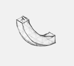
Here's a typical, challenging object: a curved chute that drops from a trap door into a lower level.


This is a worthy attempt at a complicated shape, but as you can see it doesn't look quite right; it looks a bit twisted, like licorice.

The main problems seem to be two-fold:

1. How the $#*@! do you draw a nice curve?

2. How do you take that curved surface and extude it into a three-dimensional shape?

Drawing Isometric Circles

I've taken a stab at this before, but I've found a couple of ways that are a lot easier.  Here's the basic structure, taken from this excellent blog post by Douglas Flynt:
That blog post spends a lot of time on subdividing the original square, but on isometric graph paper it's a lot easier. I'm drawing the outer curve of the chute, which has a radius of five squares:

Next step is to draw the inner curve, which has a radius of four squares:

Erasing my construction lines, I'm left with this shape:


Extruding the Shape

Now I need to extrude this into a three-dimensional form. The trick to doing this is to draw exactly the same curves one square over:


With a bit of practice you can manage this freehand, until then, you may need to set up the curve-drawing framework you used for the original lines.

Once you've got this, follow the northwest-southeast axis to "tie" the two sets of curves together. In the lower left, you're drawing a tangent across the two sets of curves:


Then, trace the lines that will be visible to get the outline of the final form:


It's still a little bit wonky; as always I recommend doing all your construction work in pencil (or better yet, with blue pencil/marker so you can pull it out with Photoshop), so you have lots of tries at the freehand curves.

Thursday, 24 November 2016

Isometric Dungeon Tutorial #3 - Village Well

Short little post today to point people to a third isometric drawing tutorial, this time a village well.

After a long dry spell of suffering with OS-basis video editing, I'm back to using a real editor, so I can make the whole thing go by much faster, while still stopping to call out a few things I've breezed by in the past, notably freehand circles.


Saturday, 10 September 2016

Isometric Tutorial Videos

I've started a series of isometric tutorial videos, showing how I draw various pieces of dungeon architecture. So far I've done some stairs and a set of arched double doors.


I'm using graph paper from Incompetech, specifically the "isodots", with the dots set to light blue. Using cyan dots lets me pull them out easily with Photoshop (using a black and white adjustment layer with the cyan slider set all the way to white).


The basic points I cover are:

  • block out the 3D space the object is going to occupy
  • ensure you're rigorously following the isometric lines - all drawings are flat, so this is important to reinforce the impression of three-dimensionality
  • finding points in 3D space often happens by finding the intersection between a vertical and a horizontal line (as with the stair creases)
  • texture adds character, but must also follow the isometric axes or you'll quickly spoil the 3D impression
  • circles are tricky - as with other shapes, first draw the square tht the square that the circle occupies, then draw it as four separate arcs
  • draw your objects from the front of your dungeon to the back so you don't accidentally
  • draw in pencil first (ideally blue, so you can use the same PS trick to remove it without having to erase)
  • use a waterproof pen, so you don't smudge your ink
  • use thicker lines to indicate depth changes between objects
Hope it's useful!

Friday, 9 October 2015

Making a 3D Map, Part 3

It's finally done! This has probably been the largest, most complicated traditionally-drawn map I've done so far.

As explained in previous posts, I don't have a scanner large enough for me to draw this at the size I wanted to work, so I decided to work piecemeal, scanning each section as I completed it, then reprinting it in cyan on card stock.

The cyan could all be all removed in Photoshop, leaving me with a mosaic of pieces to assemble.


"The old wizard hands you a map in four sections, apologizing about the size of his scanner."
I'm pretty psyched about how it turned out.  Here's the final, assembled map:

click to embiggen

To get it at proper viewing size, you'll need to check out Bedrock Games' upcoming Wuxia RPG, Wandering Heroes of Ogre Gate!


Thursday, 1 October 2015

Making a 3D Map, Part 2

With my trusty cyan maquette and my PITT pens, I've been slowly adding ink to the Tomb of the Timeless Master.  There are quite a few rooms, so I've annotated my SketchUp drawing with notes cribbed from the module.


At this point I'm grateful for the copious perspective-reference lines I sprinkled all over the maquette. For irregular structures like rocky cliff faces (which are really just scraggly lines), it's really easy to destroy the sense of perspective without constant reminders of the 3D space they're filling.


Once I've filled the page, I scan it into Photoshop to use its magic to pull out the blue lines, and clean off any crud.


To add more to the illustration, however, I add a blue gradient map, so that I can use what I've completed so far as a structure to attach the rest to.


Time to stock up on cyan printer cartridges!


Tuesday, 22 September 2015

Making a 3D Map, Part 1

I'm doing another 3D map for Bedrock Games, and figured I'd show the process I'm using here.

As usual when I do maps for +Brendan Davis, he showers me with sketches, documentation and reference images to help me out. It can be a lot to read at times, but it comes in handy when doing 'dungeon dressing'.

In this case, we're doing the Tomb of the Timeless Master, an adventure location for the upcoming Wandering Heroes of Ogre Gate wuxia RPG. It's got a lot of vertical elements - great for isometric or other 3D maps.

Here's part of the sketch Brendan sent me:


After a bit of back and forth, I knew the altitude of everything, which way the stairs climbed and so on, so I could start thinking about one of the big challenges of doing a 3D map: which angle do you pick to draw it from?

Sometimes you're rendering a location that follows Q*Bert topology. That makes the decision easy: you draw the dungeon from the angle that makes it more or less co-planar with the surface of the paper.

3D Maquettes to the Rescue

Some dungeons just aren't that simple, however, and the Tomb of the Timeless Master is one of them. After staring at it for a while, I realized the only way I was going to figure it out was to play with an actual 3D model of the dungeon.  Time to bust out SketchUp!

One of the great features of SketchUp is that you can import a 2D image to use as a reference. Below, you can see Brendan's original sketch.  I've traced the rooms, then lifted them vertically to the correct height.  Before long, I had a little 3D maquette to experiment with.


This let me rotate the model this way and that, looking for the angle that presents the dungeon in an interesting way, and with the least number overlapping elements. Some more discussion with Brendan helped here, as he decided to collapse a few stray bits to help it read as clearly as possible.

Cyan Is Your Friend

How to get from here to an illustration? I like to draw at an exaggerated scale, because that helps with the detail. Unfortunately I only have a letter-width printer and scanner.  I decided to do what I did on a previous illustration: to draw it piecemeal, and assemble it digitally.

To this end, I needed a template to make sure that all the pieces fit together properly.  The basic idea is this: print out a reference in non-photocopy blue, draw it, scan it in again, and pull out the blue using Photoshop, leaving a clean illustration for me to assemble.

With a few tweaks to my SketchUp settings, then a bit of adjusting in Photoshop, I had my template.


As you might be able to tell, I've actually decided to go with a 3D perspective rendering, not isometric at all. SketchUp makes this easy, and 

Working as a mosaic, however, means stitching together pieces of the illustration. Fortunately, the same technique I'm using for the template can work here, too. Where the pieces need to overlap, I can actually just print out the "seams" in blue, connect them by hand, and scan them in again.

Pull out the blue and I'm left with just the new, hand-drawn connection piece (in black), which fits like a puzzle piece with the two halves of the illustration I'm connecting:


Above, you can see part of the chapter heading illustration from the same book. This image appears in a few variations, which required me to join up a few "alternate" pieces of the illustration.  The woman on the left appears in two different poses, but she needs to connect to the same piece of scarf.

Stay tuned, I'll post the map once it's done!

Sunday, 1 March 2015

Quick Dungeon Method

I've been wanting to do this for a while but never made the time. Here's a video of my process for making an 'old blue' map.

I made a couple of mistakes on the video, notably setting the recording framerate to "ass", but there you go - better luck next time.


My process for making these is completely different from my hand-drawn maps, which should be obvious immediately.  The Photoshop template I'm using has a bunch of useful layer effects all ready to go.

Instead of drawing walls, I'm painting floor space.  I'm literally just grabbing basic shapes for brushes and painting in white, and the outlines grid and get added automatically.

It's a shame I didn't manage to record my mouse cursor, as I think that would make it all a bit clearer - instead of rooms appearing, you'd see me dragging a square brush around for corridors and rectangles, and then using circles and hexagons to make the various notches.

What's fun about this is that I can build up a complex outline a bit at a time (see 1:30 to 2:30) instead of knowing in advance what the outline of the room is going to be.

 Architectural adornments like this don't do anything for grid-based fights, but I hope they convey an baroque impression that would affect the GM's description of the place.  Room #6 is clearly not a crude stone room.

The texture I lay down from 7:40 to 8:15 isn't lost, I just hide it and bring parts back with a chunky 'boulder' brush. (You can then see me go around twice with a 'pebble' brush.)

The final product is a bit simplistic; it's not as lovingly crafted as hand-drawn ones, but it's really, really fast.

Monday, 5 January 2015

Trammel of Archimedes

Back in the summer I posted a method for drawing the type of foreshortened ("squashed") circles one needs when drawing circular rooms on axonometric dungeon maps.

Unfortunately it's a bit math heavy and slow, and +Nate McD was quick to point out that if your axes are truly isometric (most of my maps are actually dimetric), there's an approximation with a pair of compasses that's much faster.

Recently, however, I needed to draw this:

If you squint, you can see that it's built out of several foreshortened circles.  The problem is that perspective basis isn't isometric, the foreshortening is much steeper than that.  This rules out compass approximations, which start to look wonky at steep angles.

Making foreshortened circles is trivial in Photoshop or Illustrator, but I was working on paper, old-school style.


This method is pretty simple, once you get your head around it, it's exact (not an approximation), and it can be used for any degree of foreshortening.  It's fairly quick, but you do need to be willing to draw a freehand curve through a series of dots.

Using the Trammel


First, you figure out how big you want your ellipse to be.  Assuming it's wider than it is tall, the width is the 'major axis', and the height is the 'minor axis'. Divide each of those values in half, which gives you the 'semimajor' and 'semiminor' axes.  I've illustrated as green and blue lines, respectively.

Lay these distances out on your ruler, but in a particular way.  Starting at zero (blue circle), go up your ruler the length of your semi-major axis (green), and make a mark (shown by the red circle).

Then, come back towards zero the length of your semi-minor axis, and make a second mark (shown by the green circle).

Now, here's the neat trick.  If you place the tip (blue) of your ruler on the minor axis, and your second mark (green) on the major axis, the first mark (red) will tell you where to draw the ellipse.


Now, work your trammel: the tip (blue) slides up and down the minor axis, and the middle point (green) slides back and forth along the major axis. As you move it, make tick marks at the outer mark (red). These will trace out your ellipse:


It takes a bit of practice to get used to sliding your ruler around (it can be helpful to have a second ruler to slide the tip against), but in no time you'll have traced out your


You'll need to freehand the ellipse itself, but that just adds charm. For the Zentac Dreadnought, I used this technique for two of the eight ellipses, and then used a ruler to translate them up and down by hand:

You still need to draw the rest of the owl, of course, but it's a lot easier once you have solid elliptical guides to work from.


Saturday, 2 August 2014

Making Circular Rooms on Isometric Maps

Once upon a time there was a wizard who was forced to work in a rectangular laboratory where the feng shui was all wrong and magical eddies formed in the corners and besides they were kinda dark which reminded him of the way his homunculus would go off and sulk when the wizard wouldn't let him do the important bits and it blew his concentration and none of his rituals or traps or evil plans came to anything so when the party showed up he wasn't even there for the boss fight and it was this huge anti-climax and everyone said the campaign sucked anyway and it turned into this huge nasty thread on reddit and everybody started playing story games instead.

Dungeons need round rooms.

Unfortunately, round rooms are tricky to draw on isometric (or axonometric) paper. With a top-down map you can easily use a compass, trace a quarter or shot glass or whatever.  I recommend this - I like to think I can draw and apparently even I can't free-hand a small circle very well:

I suck - anyone have a shot glass?
On an isometric graph, it gets even trickier, because the circle is foreshortened into an oval. But what sort of oval?

I find it helpful to make guide-marks.

The guide-marks in the four cardinal compass directions are easy enough to work out: if you have a circle with a three-square radius, you just count three squares north, east, south and west, leaving a guide-mark at each of the four spots.

But how wide to make the oval?  How tall?  The red and blue ovals are two alternatives that pass through the four guide-marks.  The red circle isn't bad, but it's not quite right.


Fortunately, we can work out the diagonal distances with a little math.  We know where the northern guide-mark goes, but what about the northeast (or southwest)?  That would tell us how wide to make the circle.  What about the northwest (or southeast)?  That would tell us how tall to make the oval.

Since we're using graph paper, we can use graph coordinates and a tiny bit of math to figure out where the diagonal should go.  The question to ask is this: how far north (or west) does the NE diagonal reach?  The answer is:

coordinate = sin( radians(45) ) * circle radius

sin is a trigonometric function, and the radians function converts an angle in degrees to the same angle in a funky unit called radians.  (Most sin function implementations expect radians.)  These functions are available in both Google Docs Spreadsheets and Excel.

For a radius-3 circle, you should get an answer that rounds to 2.1.

Photoshoppery

If you're using photo-editing software like Photoshop or Gimp, this is the only measurement you need.  (If you don't like doing calculations math, I'll provide a handy table for you, below.) Measuring this out on the graph paper looks like this:


I measured toward the southeast, but any direction would have done just as well.  The point where the dotted lines cross is also a point on the circle.  In your editing software, draw an oval that goes through all five points.

This isn't a Photoshop tutorial, but briefly: use the oval tool set to 'path' mode.  Start at the circle's center, click and drag.  Then hold down the Alt key to force the oval to be centered on the starting point.  Drag around until the oval you're creating passes through all five points, then release.  Use the 'stroke path' command to turn your path into a usable outline.

It should look like this:


The Traditional Way

If you're drawing a map by hand on graph paper, you'll probably need more guides that this.  As a reminder, guides can be drawn in any direction - here I've added the 45-degree diagonal reaching to the northeast:


We've drawn diagonals at 45-degree increments, so for the next level we'll cut that in half: 22.5 degrees.

We need a bit more math. I simplified before, because the north and east coordinates for a 45-degree diagonal are the same, but they won't be for our next set of diagonals.  The coordinates are:

coordinate 1 = sin ( radians( angle ) ) * radius
coordinate 2 = cos ( radians( angle ) ) * radius

For a radius-3 circle, our two new coordinates are: 1.1 and 2.8.  Mark your three coordinates (1.1, 2.1, and 2.8) on each of the four axes, then draw in guide lines for them, parallel the grid lines on your paper.


Use a ruler to make the guides nice and straight or the inaccuracies will add up and your circle will suck, and we'll be back to sulking homonculi all over again.

Admittedly it looks a bit intense, but it's fairly straight forward once you try it.  But what the hell is it for?  It makes more sense once you visualize your circle in there, and how it passes through the guide intersection points:


Rendering the Circle

You're now ready to pencil in your circle.  While you're doing this, there's one last bit of information that will help you: the angle of the curve at various points.  These are called the tangents (a tangent is a line that just touches a curve).

The cardinal tangents are easy to work out: they follow the grid lines:


The 45-degree diagonal tangents are also easy to work out - they're horizontal and vertical lines on your paper:

The Final Strokes

Now, since you're doing this traditionally, you've got no choice but to extrapolate from your guides and hand-draw in the curves.  This usually takes me a couple of tries for each segment, so I use a light touch and keep an eraser handy, but we have plenty of support from the all of the guides we've built up:


Do your circle pencil, of course, only going over it in ink when you're happy with your pencil version. The finished product should hopefully look something like this:


All ready for some magical rituals!

That Chart I Mentioned

If you don't have a calculator handy, you can use this chart:


If your wizard needs a lab bigger than 32 grid squares across, she'll have to use the equations. Comes with the territory.

Circles on the Brain

Of course, there's a reason I'm obsessing about circles. Once you know how to do a circle, you can use portions of circles to make all sorts of interesting things.

Here's the the start of a map I'm working on for an upcoming adventure, the hull of a mighty ark:


This has five layers of semicircles at each end of the ark.. which took a little while.

Thanks again to everyone who's been supporting my adventures on Patreon!