Thursday, 19 December 2019

Band of Blades

I'm currently a player in a Band of Blades campaign, an interesting system with some noteworthy bits of game design—particularly the way that it's so focused around its campaign.


To say it comes with a campaign isn't strong enough, the fibres of the campaign are woven all through the characters. More on that later!

Band plays out the story of a company of Legionnaires in a war against an undead army, on a long retreat through lands that are about to fall. Gameplay revolves around missions such as rear-guard assault actions against the advancing horde, recon forays to gain intel advantages, and negotiations (or heists!) to secure precious assets like magical relics before they're lost forever.

The system is based on Blades in the Dark, and so task resolution uses a d6 "take the highest" dice pool approach. 1-3 is a failure, 4-5 is partial success, and a 6 is a clean success. A GM-set difficulty level provides guidance on the stakes: against a Controlled roll, it's never that bad, but on Desperate rolls, even a clean success is going to feel like you barely got away with your life.

The mission characters are reminiscent of PbtA playbooks: everything, including advancement options, is on one double-sided sheet folded into a little booklet. Characters are strongly drawn archetypes, and pretty easy to roll up in the case of death. And there's lots and lots of death!


There's too much to say to summarize the whole system, but there are a few details I want to call out, first of all equipment:


Each archetype comes with a different list of items they might be carrying. There's a more complete equipment list in the rulebook, but if you're making a replacement character because your Lieutenant just got dissolved by acid spray, it's really quick. Choose your load-out level: light, normal, or heavy (which affects your movement speed), and then tick a few boxes and you're done.

This is doubly handy not only because of the high lethality of the game, but because it also uses troupe play: the specific legionnaire you play can change from mission to mission, depending on the personnel required.

Strategic Characters

The most interesting thing about Band, however, is the strategic level of play. In addition to whoever they're playing for a given mission, each player is permanently assigned a high-ranking officer of the legion: a commander, marshal, spymaster, or quartermaster.

Each of these roles comes with a playbook 'character sheet' of its own, which cleverly divides up the running of the military campaign between the players. Three that figure prominently:
  • The commander is responsible for choosing where the company goes on the campaign map, and which missions it undertakes.
  • The marshal is responsible for the company roster, monitors company morale, and chooses which of the many legionnaires are in play for each mission.
  • The quartermaster is responsible for tracking the supplies of food, wagons, horses, undead-killing black shot, and other consumables, and makes the choice of when to dole these scare supplies out to the mission squads, and when to conserve them for later.
Commander and Marshal sheets
This is a really neat bit of design for a few reasons. One, it's a firm set of recipes that help the table cook up the specific campaign the designers had planned. The game isn't going to drift into leadership rivalries, interpersonal drama or personal quests for power, this is a game about running a military campaign.

Secondly, by dividing up the responsibilities of the company among separate players, it keeps down the cognitive load any one player has to deal with, and at the same time keeps so-called quarterbacking to a minimum.

The strategic level alone makes the game worth playing this game just to see how the pieces fit together. In my opinion, this kind of design has a lot of potential for games of all sorts.

Wrinkles

Like any game, there are a few aspects that aren't a perfect fit for me.

First of all, it's surprisingly crunchy. It's a thick book! This isn't quite a pick-up-and-play game, despite the pick-up-and-play design of the characters.

The core design is very elegant, but there's a layer of richness/complexity, lots of special rules and powers that give the party a palette of mechanical bonuses and doodads to consider using when they're resolving actions. This takes time that works somewhat against the immediacy of the fiction.

My second issue is how this complexity relates to "clocks." Clocks are GM-defined countdowns to specific events, such as an angry crowd rioting, a shaken company of allies routing, or the dwindling strength of a fortification under siege. It's a useful way of pegging a number onto a narrative outcome so that you can tackle it with the rest of the mechanics - teamwork, devil's bargains, relative threat level, etc.

At the same time, there's something slightly odd for me about the juxtaposition of such a simple mechanical signpost at the edge of the 'fiction' and all the player-side crunch. Imagine a D&D 3e party spending five minutes on how they ought to stack their buffs, feats, magic and actions to do maximum damage to Tiamat, but the GM is hand-waving Tiamat's AC and hit points.  (This is not a fair comparison.) Maybe a better image is riding a stationary bike on the holodeck. It raises the question, why do all that work?

Final complaint: with so many characters, the table quickly gets buried under character and reference sheets, and with the aggressive edge design, they all look absolutely identical at distance. It would be really handy if strategic playbooks looked more different from mission playbooks, and any distinctive iconography to help the archetypes all stand apart better.

Troupe Play

Band has given me a lot to think about for troupe play, and its mirror image, open table play. Band accommodates drop-in players extremely well. Our friend and former regular Sean has been away in Europe for ages now, but he recently swung through the city and was able to take on the role of a special character we'd recruited the session before. That was great!

On the other hand, I don't think completely open table play would work well with Band of Blades; the strategic characters really do need to hold the continuity of the mission, and a drop-in quartermaster or marshal doesn't seem like it would work.

What might be fun, though, is playing the strategic game online with a steady cast of players, but then having an open table resolve the actual missions!

Conclusion

In any case, it's a very enjoyable game, and there's a lot to learn from it. I think the built-in campaign length was chosen well, too. Normally we're rotating games in every 4-5 sessions, but this will go at least twice that long if we're going to have any shot of actually reaching Skydagger keep. This is good, as it's giving us time to see the characters as they evolve.

Next stop, Fort Calisco!

Sunday, 24 November 2019

Limiting Ink Density

If you're printing at Lightning Source, e.g. because you're doing a POD product at DriveThruRPG, you have to abide by LS's printing specifications. One of those is a so-called "ink density limit."

What is an ink density limit, and how do you stay within it?

As I wrote in the last post, printing presses use four colors of ink to replicate the colors in your digital files, cyan, magenta, yellow, and black.. CMYK. Most colors are reproduced using a combination of multiple inks. Darker colors need more ink, as do more saturated colors.

For especially deep, saturated colors like inky maroons or really dark, muddy greens, you can need quite a lot of ink - black, yellow, and magenta. Just like coloring over the same spot over and over again with a marker, too much ink can wrinkle the paper, or cause smudging and bleeding before the ink has had time to dry.

For this reason, Lightning Source imposes a blanket restriction on the total amount of ink any one spot on the paper can take, to 240%. Their darkest, richest black allowable is achieved by 100% black ink, with 60% cyan, 40% magenta, and 40% yellow.

Do we have a problem?

Waiting for Lightning Source to tell you that you have an ink density problem is going to ratchet up your turnaround time. It takes several days for DTRPG and Lightning Source together to check, process and then reject your PDF. Better to check it yourself.

The best way to check I've found so far isn't great, as you have to skim your whole document by hand in InDesign. Even so, it beats losing half a week to turnaround time.

Open up the so-called 'Separations Preview' panel, in the menu: Window | Separations Preview.

(It's called that, because it's a preview of how your document colors will be separated into the four different inks.)

Turn the 'View' to 'Ink Limit', and then change the numeric value to '240%', like so:


This causes your document to be re-rendered in a washed-out gray, but with any areas that violate the 240% limit picked out in red.

For example, here's an ink-heavy map from my compendium in the normal view:


Here's how it looks with the Ink Density limit preview on:


If you click on that to zoom in you can see a few areas have been called out by InDesign as busting the ink density limit.

Why those areas? There are some dark, muddy browns there - they're close to gray but not exactly gray, which means you need a combination of cyan, magenta, and yellow to reproduce them on paper. They're also really dark, which means a bunch of black ink goes on as well. Soggy.

InDesign doesn't seem to have any sort of whole-document pre-flight check for ink density, which means there's no simple way to find these problems without scanning the whole document. (If you know of one, let me know!)

Checking Ink Density in Photoshop

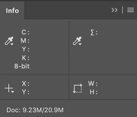
Unfortunately, Photoshop only allows you to check a single pixel at a time. Open up the Info panel, and click the eye droppers to change its display options. You want to see the CMYK color, and Total Ink views.


As you mouse around your image, Photoshop will show you the total ink density. This isn't really useful for finding problems, but it's a decent way to check that you have fixed them. (See below.)

Fixing Ink Density

Fixing ink density problems can be tricky for indie publishers, particularly if the publisher/artist roles are played by separate people and the publisher only has InDesign, and the artist only has Photoshop.

If you're the publisher:

  1. You may need to explain to the artist what ink density is, and how to spot check it.
  2. Send the artist a screenshot of the ink density view from InDesign, so they can see the problem areas.

If you're the artist:

  1. Learn what ink density is, and how to spot check it.
  2. Find out from your publisher what the problem areas of the image are, so you can check them out
  3. Keep your original art piece separate, because many of the methods of fixing ink density are destructive, making permanent changes to the art.

Method 1: Tweak the image

This involves some trial and error, but some combination of level adjustments, curves, and desaturating dark colors can fix ink density problems. This may keep you in your comfort zone, but it strikes me as a little haphazard for two reasons:
  • Photoshop doesn't seem to have any built-in adjustments that target ink density. Because density is a subtle combination of high saturation and low brightness, there's no blend mode or levels solution that's a guaranteed fix that won't wash out the image (as far as I can tell).
  • Checking your work isn't isn't easy, because you can only check one pixel at a time. By the time you've fixed the problems, but then re-adjusted so your image isn't washed out, you might have caused new problems elsewhere.
I welcome tips or links to articles about this approach.

Method 2: Convert to the printer's recommended color profile

Converting to some specially designed color profiles seems to fix ink limits.. sometimes.

For this method, you should probably learn what color profiles are so you have some idea of what's happening.

Applying the profile is easy (once it's installed). In Photoshop, use Edit | Convert to Profile, and pick the printer's profile.

A key limitation of this approach is that ink density limits are not a feature of color profiles. Reducing the ink density can be a side effect of a profile conversion, but there's nothing in the profile that sits there as an ongoing safeguard against ink density problems.

Photoshop does its best, but if you have any layers in the multiply blend mode, while each layer individually might respect ink density limits, the resulting final pixels can still blow past the limits.

For this reason, if you rely on a color profile conversion to fix ink density you should:
  • Flatten the image first (to get rid of blending mode interactions)
  • Limit the amount of adjusting you do afterwards, e.g. fixing the contrast
  • Spot check problem areas before you declare victory
Currently, DriveThruRPG is recommending that art be converted to the CGATS21_CRPC1.icc profile, which you can download from them.

Method 3: Convert to custom CMYK profile settings

If you can't figure out the printer's target color profile, Photoshop will let you manually specify an ink density limit if you convert to a 'custom' CMYK profile.

Choose Edit | Convert to Profile..


Chose the CMYK destination space, then pick 'Custom CMYK' as the profile. When the profile customization dialog pops up, type in '240' as the ink density limit:


..and that's it.

Finally, spot check any problem areas your publisher highlighted for you, and any other likely problem areas if you do any adjustments after the conversion.

As with using the printer's color profile, there's nothing magical about converting to CMYK that will keep your image within the ink density limit if you adjust it. It may already be out of whack if you have blend mode interactions, so try this with a flattened version of the image if your spot checks.

Send it back to the publisher and.. good luck!

Saturday, 23 November 2019

Basics of Color Profiles

Any time you're tangling with a print run or POD, you're going to have to tangle with color profiles. This is a confusing subject, and the fundamentals are elusive. There are lots of, "Well, what worked for me.." type posts, but relatively little on exactly how and when InDesign uses the many color profiles at play for any given document:

  • InDesign's current "working space" color profiles
  • The document's assigned color profiles
  • The color profiles embedded within any images included in the document
  • The Proof Colors color profile
  • The color profile you're exporting to
To make this more confusing, many of the conversions can be tweaked or skipped by either document-level or InDesign-level overrides.

Welcome to my journey of trying to figure out color profiles. Warning - this isn't a "how to" document, this is me trying to feel my way through the fundamentals so I can understand wtf is going on better, and so I can piece through the implications of the instructions that different printers give me.

Encoding Colors

To explain what color profiles are, I first need to explain how colors are encoded. In indie publishing, most of the colors we deal with are so-called process colors: instructions to some machine for reproducing a color. (These contrast with spot colors, which are like Pantone paint chips, pre-agreed, specifically named colors.)

You're probably familiar with the RBG scale, which has red, blue and green components, each from 0 to 255. These numbers are an instruction to a monitor about how much red, blue, and green light to send. 0 means 'none', and '255' means, "as much as you can."

An RGB value of 255, 255, and 255 is the most light a given monitor can send, which is white—or, at least, as white as that monitor can get.

Here's the first problem: "as much as you can" isn't very specific. That's going to depend on the monitor!

Print colors have a different process, based on combining four colors of inks: cyan, magenta, yellow, and black, CMYK. If all the numbers are zero, c=0, m=0, y=0, k=0, then no ink is laid down. If all of these are set to maximum, that tells the printer to print the darkest color it can, a thick, rich black.

Again, "the darkest color you can print" is completely different from printer to printer.

Color Profiles

This is where color profiles come in: the color profile indicates what machine the instructions were for.

If I'm trying to be precise about color, "as blue as you can get" isn't good enough. That will look completely different on each device I try it on.

If I say, "100% yellow on a Brother 3-400c inkjet with C-series Brother inks," then you can understand what specific color I'm talking about, and reproduce that on another printer. On a fancy printer with better inks that give it a greater range of yellow, the identical looking yellow might be only 95% of its maximum yellow.

Thermometer Analogy


I like temperature as an analogy. We can probably all agree that zero degrees is cold, and 300 degrees is pretty hot. That's fine for chatting casually, but if you're trying to follow a recipe that says to "cook at 250 degrees," you really need to know the scale: Fahrenheit or Celsius.

If just turn your oven to 250 degrees and hope for the best, you run the risk of cooking at the completely wrong temperature. If the recipe was supposed to be Celsius but your oven is in Fahrenheit, then your meal will still be raw. If the recipe was supposed to be 250 Fahrenheit but you cooked at 250 Celsius, you're going to get a black brick for dinner.

In print, this translates to dark colors coming out all washed out, or the whole image having a weird blue cast to it. "You said medium blue.." isn't precise enough.

So: color profiles are like 'Fahrenheiht' and 'Celsius' for color.

Gamuts


Now, not only are some ovens in Celsius and some are in Fahrenheit, not all ovens have the same temperature range. My oven goes from 150F to about 550F, but someone else's oven might only go up to 525F.

With colors, the range of reproducible colors is called a gamut.

You can see, below, the very different gamuts of the 'Apple RGB' profile and Friesens' 'GRACoL' CMYK profile.


The RGB profile can produce brighter reds, vibrant light greens, and luminous evening-sky blues. The GRACoL profile, on the other hand, can't do any of those colors. It's greenest green is a medium, grassy color. This makes sense, it doesn't actually have green ink, it has to make green out of yellow and blue. The more saturated the desired green, the more ink it has to use, which is self defeating because more ink you use, the darker things are.

On the other hand, GRACoL has a slightly better range of yellow, which makes of sense - it's a print process that uses bright yellow ink. The RBG profile has to make yellow out of green and red, so 'very yellow' tends to wash out because the more colors of light you use, the whiter you get.

The gamut differences are one source of unexpected color changes when you go to print: you've asked the printer to make a color it can't make, so it does the next best thing. The "next best thing" might look like total crap - particularly if you've got radiant light shining through new spring leaves, and they all come out looking like grass on an overcast day.

The point here is that color profiles really matter, because "as green as you can get" isn't just slightly disappointing, it could be a completely different color.


Managed vs. Unmanaged Color


InDesign and Photoshop use the term 'managed color.' Simply, managed color means that the colors have an identified profile (e.g. 350F), and unmanaged means they don't (um, just.. 300 degrees, y'know?).

Most projects will start out from ingredients—images, colors chosen in InDesign—which are a mix of managed and unmanaged. For example, it's common for digital artists to supply artwork in RBG, without a declared color profile. (Guilty!)

This is a second source of unexpected color conversion problems. You might know that your oven works in Celsius, but if you don't know what the recipe was using, it doesn't help you interpret what '280 degrees' means. You are forced to decide: was it Fahrenheit, and I should convert that to Celsius? Or was it Celsius already, and I should simply assign the Celsius scale to this number?

A note on "Assigning" vs. "Converting" Profiles

These terms come in various places in InDesign and Photoshop, and they do similar but different things.

Profile conversions attempt to keep the target color the same, as instructions for a different profile. For example, if I have a temperature of 200F, and I want that in the Celsius 'profile', the conversion result is 93C.  These are the same real-world temperature, just represented in different scales.

Assigning a profile, on the other hand, keeps the numbers the same and simply asserts that the numbers are supposed to be interpreted in a given color profile.

For example, going from the temperature, "um, 200, y'know?" to "200F" is me assigning the Fahrenheit scale. This is a little dangerous, because maybe it was supposed to be Fahrenheit, but maybe not. If the recipe author meant 200C but was lazy and left off the C, then my output is going to be too cold. Assigning clearly needs to be done with care.

In general, the earlier in the process you start managing color the better, as this reduces the chance of unexpected conversions.

Multiple Profiles at Work

A complex InDesign document is going to be made of lots of different pieces: borders and solid blocks with colors chosen in InDesign, and images from all sorts of places (stock art from the web, scans from artists, etc.)

InDesign can keep track of the color profile of each of these pieces separately. This is a bit like a recipe that specifies the starting temperatures of the ingredients:
  • a potato from your root cellar at 18C [embedding the Celsius profile]
  • a zucchini from your fridge at 10F [embedding the Farenheit profile]
  • a turkey from your freezer at -18C [embedding the Farenheit profile]
  • 5mL of ethanol from your liquor cabinet, at 292K [embedding the Kelvin profile]
By keeping track of the profiles of each of the pieces, InDesign can make its final export in a color-preserving way.


What All Those Color Profile Do

Okay, so here's my understanding of how all the color profiles interact in InDesign!
  • InDesign's current "working space" color profiles
  • The document's assigned color profiles
  • The color profiles embedded within any images included in the document
  • The color profile you're exporting to
  • The Proof Colors color profile

Working Space Color Profiles


If you pop open Edit | Color Settings, you can see InDesign's current working spaces color profiles. There's one for RBG and one for CMYK.

As best I can work out, the working space color profiles are just used as a kind of fall-back default for the document: if your document doesn't have an explicitly assigned profile, InDesign will assume the current working space is the color profile.

If your document has an assigned color profile, the working space color profile has no effect whatsoever.

Document Color Profile(s)


The document's two color profiles (again, one for RBG and one for CMYK) are an explicit way of saying, "Unless I say otherwise, all the stuff in this document is in this color profile.)

How do you tell if your document has an assigned color profile? Pop open Edit | Convert to Profile, and look at the Source Space:


I think what's happening here is that my document does not have an RBG profile specified at the document level, it's just borrowing from the current Working Space.

On the other hand, the CMYK is explicitly set to CGATS21_CRPC1.icc, so I do have a document level CMYK color profile.

From what I can tell, having an assigned document color profile is a good idea. If you're working on multiple documents, destined for different printers (PDF, an offset print run, DTRPG POD), you definitely don't want to be remembering to switch an application-level setting back and forth to make sure your inputs are interpreted correctly. That's begging for trouble.

Linked Image Embedded Profiles


If you want to check the profiles of all your source images, open the InDesign Links panel. (Window | Links). You may need to go into the panel settings to adjust which columns are displayed, but either way the Link Info area will show you the color space (RGB vs. CMYK) of each image, along with any embedded color profile.


Here you can see that the "Dragon skin" image I've included is an RGB image, in the 'Display' color space.

I believe that images which don't have an assigned color space will be treated as if they are in the document's color space, or the working space if there isn't one at the document level.

This strikes me as a rather haphazard fallback plan, because InDesign's interpretation of your colors will depend on whatever working space you have chosen today. That might vary from task to task, so it's probably wise to specify at the image level.

Export Destination Color Profile


Depending on your export settings, the 'export to PDF' process may convert color profiles to a different destination color profile. There are a lot of settings here, as conversion is a rich area. I'm going to focus on the Color Conversion and Destination settings.


There seem to be three conversion approaches:

1. Don't convert anything: leave everything in the original color spaces, if any are specified. If there are assets without specified color spaces, then leave them unspecified.

If you choose this option, you also get to choose a Profile Inclusion Policy for the embedded assets. This basically controls whether InDesign embeds your images' current color profiles into the final PDF, or strips them off.

2. Convert to Destination: remap all the colors into the chosen destination profile (which, again, should probably not be your working space unless you like settings bleeding from project to project).

This setting comes with a warning that any unmanaged colors that have made it this far are just going to get assigned to the destination color space, whether that's right or not. (151 degrees? I'll assume they meant 151. It'll be fine.)

3. Convert to Destination (preserve numbers): This setting remaps colors into the destination color space, but only if InDesign can work out what the source color space was. In other words, if you're exporting to Fahrenheit, it will convert 93 Celsius into 200 Fahrenheit, but if you have a temperature of '151' specified somewhere, with no scale, it will leave it as 151 with no scale.

Which of these export settings you want is going to depend greatly on your printer. But, two principles come to mind:
  • Your printer will probably insist on particular settings for this step.
  • If any colors are unmanaged at this point, you're relying on the default assumptions of your printer on how it will interpret '151 degrees'. You should probably know what those are.
A note on conversion methods
  • Perceptual conversion tries to preserve color differences within the converted images, squeezing the source color range into the destination color range.
  • Colorimetric conversions just take the source color and find the closest matching color in the destination profile.
These two methods have the biggest difference (I think) when the source and destination gamuts are very different.

If you're going from a big gamut into a smaller one (e.g. RBG into CMYK), perceptual will dull down the contrast of the whole image so that its range of colors fits into the target gamut. In situations where the destination gamut is larger, this may expand the range of colors used into that gamut somewhat. (I don't know this.)

Colorimetric, on the other hand, leaves the parts of the image that convert cleanly untouched, and only fiddles with colors that don't have direct analogues. Un-renderable colors are just substituted for their closest match, other colors are unmodified, and any additional range in the target gamut simply goes unused.

Most resources I've found recommend using relative colorimetric, but also tend to recommend pre-converting your images into the destination space so you don't get any unexpected effects, and not relying on last-minute export-time conversions.

Proof Colors Space

Finally, InDesign has a setting that lets you preview what your colors kinda sorta might look like after export. If you go View | Proof Setup, you can choose a destination color profile, which I assume should match your export destination profile.

This has no effect on your document, other than to show you, on screen, what InDesign thinks your document will look like post-conversion. This is of course approximate, and is of course impossible for ink colors that your monitor can't display.

Also, I assume the preview just assumes you're converting all colors to the preview space, which might not be what your export settings are doing.

This feature seems to interact weirdly with unmanaged colors, but I haven't poked around here extensively.

So What?

This is all part one of me struggling through DTRPG's POD color requirements. There may be a follow up when I post what I've learned when I'm completely done!

Thursday, 31 October 2019

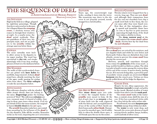
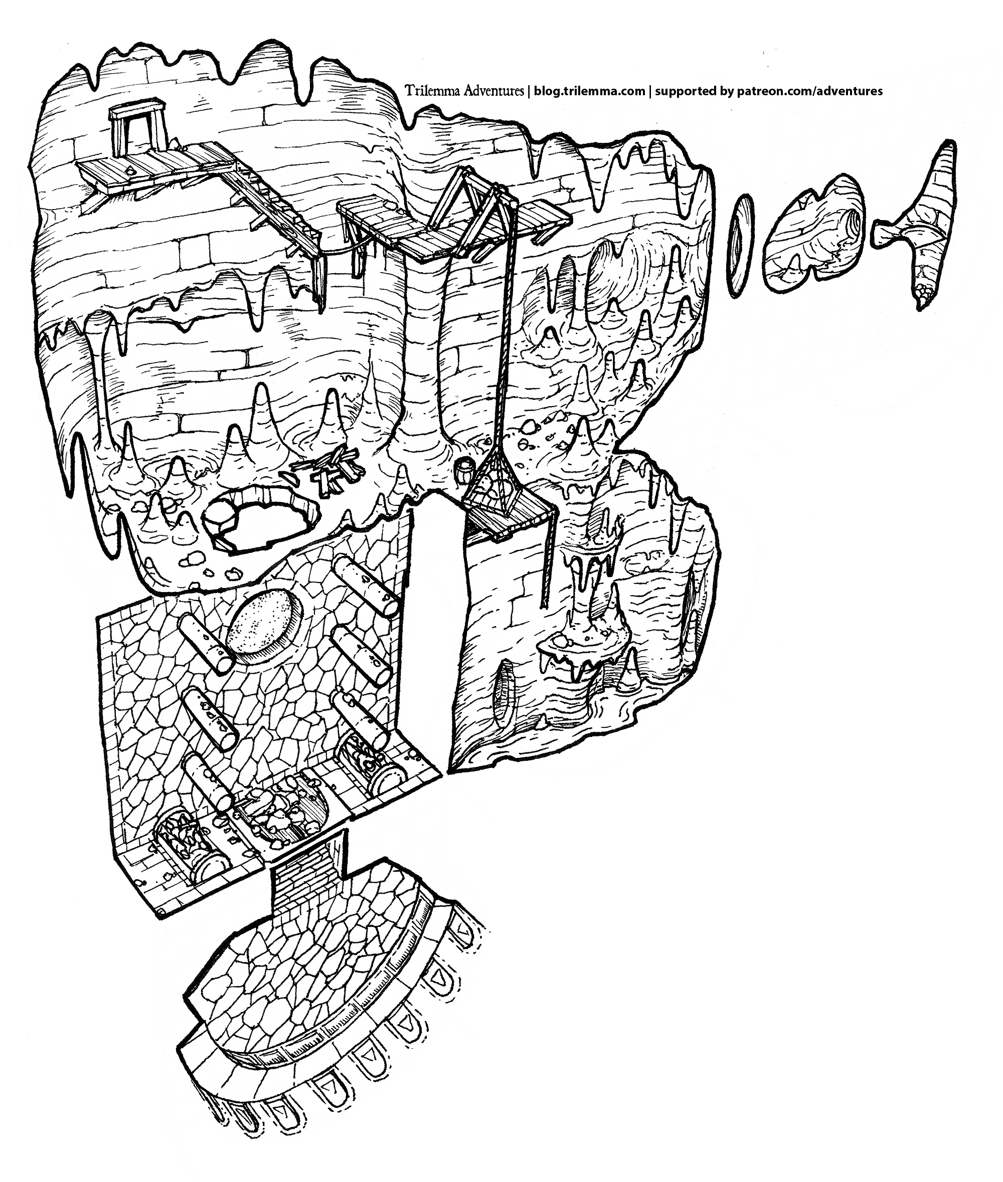
The Sequence of Deel

High in the hills is a village plagued by nighttime poisonings. Victims claim there is a crone who comes creeping in through windows and chimneys to smother and sting them, though none has seen her in the day. If she exists, she is but one part of the sequence of Deel.
PDF Link: Sequence of Deel
Finally, I'm back to adventure-making! I wrote this adventure to explore my setting's vampires, which feature in the compendium bestiary despite only the briefest of mentions in the Task of Zeichus.

This probably won't arrive in your inbox in time to use for Hallowe'en, but I think the crone is a delightfully creepy way to hook players into a relatively classic dungeon with a twist.. or should I say a tilt.


If you enjoy short-form adventures like this, there's a compendium of 48 of them up on DTRPG!

As always, thank you to my generous Patrons, whose donations mean that the text and map art for this adventure are free for you to use non-commercially under CC-BY-NC 4.0.

Happy hacking, and close your windows tightly!

Sunday, 27 October 2019

Compatible with Dungeons & Dragons

This blog post is compatible with Dungeons & Dragons™ fifth edition. :)

* * *

I'm now in the world of feeling my way through creating various system-specific versions of the Trilemma bestiary, en route to publishing them.

My thought at this point is that there is a lot of murky thinking about what you can and can't publish, and this murkiness is a) deliberately created, and b) mostly helps the big players, like WOTC.

I'm not a lawyer, but this is what I've been able to piece together.

1. Large IP holders want you to believe that their official programs are the only way to produce compatible products

If you want to make a D&D-compatible product, prevailing wisdom is that you have two choices: use the OGL, or use the DMs Guild. (Why is there no apostrophe in that?)

I can understand why the WOTCs of the world would want you to think this. People have a very hazy grasp on copyright law and trademark law, and if they just used their intuition all sorts of IP violations would occur. There's a very common idea, for example, that derivative works are fine to create and publish if you're not making money on them. (They're not.)

Official programs are a way of being really clear about what the IP holder is willing to allow people to do.

2. Licensing agreements describe an exchange

Licensing agreements give you something in exchange for something. For example, if you look at Paizo's compatibility license, it describes an exchange between you and Paizo:

  • You can use Paizo's trademarked "Pathfinder compatible" logo, and the associated font in your products
  • Paizo gets your agreement that you'll only make 2e-compatible stuff, they get a copy of compatible products from you, and you agree not to refer to page numbers in their books.
Both of these things are new rights that each party didn't have previously. You didn't previously have permission to use Pathfinder's trademarked logo, and (of course) Paizo can't prevent random people from referring to Paizo page numbers.


Briefly, I've noticed a few things are common in licensing agreements:

  • You're given permission to use copyrighted text (as in the OGL)
  • You're given permission to use trademark logos
  • You're given permission to use trade dress, fonts, or stylings
The D&D 5e SRD, for example, is licensed under the OGL (which grants permission to use copyrighted text) because they expect people to take chunks of that text and use it their publications. It gives the new right to republish copyrighted material.

3. Creating a licensing program doesn't remove any rights that you already had

This seems like a straight forward idea, but it's worth dwelling on.

Let's say WOTC created a new program called the Reviewing Wizards program. By agreeing to their license, you're allowed to call yourself a Review Wizard™ and use a special little -(RW)- logo when you do so, and in return you agree never to publish a negative review of a WOTC product. Fine.

Is this the only circumstances that you're allowed to publish reviews of WOTC products? No, of course not! WOTC creating this program doesn't suddenly give them control over all negative reviews. It only applies to participants in the Reviewing Wizards program.

If I'm publishing negative reviews of WOTC products, I can't use the Review Wizard™ trademark, because I didn't license it, but if I don't join that program and take the new rights it grants me, I don't have to abide by its restrictions. I can still do what I could do before.

So.. what can I do without permission?

4. Fair use of trademarks

Before I get into that, there's a difference between compatibility and statements about compatibility:

  • A book with 5e stats in it is (in a lay sense) compatible (usable) with 5e.
  • A book that says it's "compatible with Dungeons & Dragons™" on the cover is using a WOTC trademark to describe itself.

These are independent things. Okay, back to trademarks.

The International Trademark Association's page on the fair use of trademarks is fascinating, because you can actually do quite a lot more than you might expect. The examples are useful, because there's a whole bunch of, "Oh yeah.." recognition moments. Think of:

  • Third-party replacement blades for Gillette™ razors
  • Repair shops that advertise being able to fix BMW™ cars
  • Third-party sellers of iPhone™ 6 phone cases or chargers
  • Unofficial guides to AAA video games
All of these are services or products that are compatible, but which also use another company's trademarked terms to describe themselves.


* * *

Why does all this matter? Frankly, because some of the popular licensing programs out there are batshit insane. So now, let me put on my Review Wizard™ hat and review some licensing programs.


Legal Lunacy: OBS Community Programs

The DMs Guild (why is there no apostrophe?) was the template for a number of OBS (DriveThruRPG) community content programs, and to use them, you give up some remarkable things:
  • You can never publish the work anywhere else—not in print, not via Kickstarter, not on itch.io, not on your blog, not anywhere. If they delist your product or the whole community content program shuts down, your content is then simply unpublishable.
  • You can't publish works derived from it anywhere else, either.
  • The publisher gets a permanent, irrevocable right to republish your work, including creating and selling derivative works. They can translate it, slice and dice it and put it in compilations, without paying you a dime or even telling you.
  • OBS can sign legal documents on your behalf, operating as your 'attorney-in-fact' if they need new contracts to clarify or affirm their rights, as they see them.
That last one is so mind-bendingly overreaching that it's comical. You're giving them permission to negotiate for you, with themselves. It's like the devil wrote it.

As far as I can tell, the only reason to use this is if you're so smitten by the D&D brand that you want to rub that cachet on yourself, and/or blow hundreds of hours of hard work on a desperate notice me sempai play.

If you're going to market the hell out of your product (or cash in on your good name), then it makes a kind of sense: the median DMs Guild product makes 10% more revenue than the median DriveThruRPG product (sales are higher, but the WOTC clawback is almost aggressive enough to make up for it), but at the cost of giving away all rights that matter.

Alternately, if you have no marketing impulse whatsoever all and 50 sales sounds good to you, then these programs makes a kind of sense because at least you can play with WOTC IP while you're doing it.

For non-WOTC publishers who are too small to boost your sales or give you much IP to play with, I can't fathom why you'd touch an OBS community content program. This is the infectious green slime of licensing programs.

OGL

This is a funny one. As far as I can tell, the only reason you need to use the OGL is to republish OGC content. If your content is all new, there's no need to use the OGL whatsoever—in fact, you're explicitly giving up some fair use rights unnecessarily, since the OGL prohibits you from using Product Identity trademarks to declare compatibility.

In other words, if you reuse 5e SRD to make a 5E-compatible product, you're explicitly giving up the right to say it's D&D compatible.

If you're not actually republishing someone's OGC material, using the OGL looks like you've given up some rights for nothing.

Pathfinder Compatibility

In contrast, this actually looks pretty reasonable. You're forced to use the Paizo OGL, but the compatibility license gets rid of OGL's major restriction on the fair use of trademarks for compatibility statements, by letting you use their Paizo Compatible™ logo.

Also, it should be worth mentioning that Paizo doesn't take a cut. They haven't created a garden prison like WOTC, they just want to make sure that people are writing for the latest edition of Pathfinder.

* * *
D&D™ Compatible
In conclusion, contrary to popular wisdom, D&D™-compatible products which say, Compatible with D&D™ on the cover seem to be completely legal. As long as:
  • You're not using any WOTC-copyrighted content that would require you to use the OGL
  • You use the trade marks in a minimal way (e.g. no giant logo reuse, just naming them)
  • No brand confusion is created, and no business relationship or endorsement is implied

Pay To Win

The sad fact is that, despite all this, having a heavyweight legal team lets you send scary-sounding cease-and-desist letters, and fighting them is too stressful and expensive for little publishers. Most (all?) of the fair use of trademarks examples I cited above were established by litigation, which is horrendously expensive.

One depressing but useful benefit of participating in an official license scheme is as a declaration of what the publisher won't try to bully you for doing.

      Sunday, 6 October 2019

      13 Items of Equipment

      A week ago, I asked folks on Twitter to evoke a setting using only a 13-item equipment lists. They have done so!


      Now I need your help. Which one do you like best? Here's what I was hoping for:


      1. Vivid: Looking over the list transports me to another time and place. It's so vivid I can almost smell it.
      2. Charged: I can feel the hopes, dreams and fears of whoever's gear this is. This is a gear list for doing things.
      3. Flexible: I could equip several different characters from this list, each of whom would be strongly drawn and distinct from one another.
      4. Distinct: The setting is an interesting take, distinct from clear genre buckets like 'fantasy' or 'sci-fi'.
      5. Subtle: The list evokes the setting through through the cumulative effect of the entries, rather than using exposition in item descriptions.

      Read the entries, then vote on your favorites by liking the tweets!

      Wednesday, 25 September 2019

      Compendium PDF Available

      Did you miss the Kickstarter? It's not too late! The Trilemma Adventures Compendium Vol I is now available in PDF on DriveThruRPG.


      The book contains 48 Trilemma Adventures, from Stellarium of the Vinteralf to The Mouth of Spring. Each one has been reformatted, re-edited, and in some cases extensively rewritten, re-illustrated or expanded.

      Also inside are 70 pages of new material:
      • an illustrated bestiary with 97 denizens of the adventures
      • an appendix of 86 rarities & magical items
      • ten solid pages of hooks, rumors and secrets
      • 6 regional gazetteers tying the adventure locations into a ready-to-use campaign setting
      • a full-color regional map, in GM and player versions
      • a complete index of places, people, cults, sorcerers, demigods, and more
      • 6 pages of lore revealing the origins of the Martoi, the Seree, and more
      • a bonus adventure, Into the Silent Temple, set in the aftermath of the Kickstarter invasion scenario

      Tuesday, 28 May 2019

      Compendium: 48 Hours Left

      We're now in the final 48 hours of the compendium Kickstarter campaign. This is your last chance to sign up for the limited edition hardcover book.

      Generous backers ripped through all of the stretch goals I put down, over and over again. We now have only one left: the map pack PDF.


      This means the book now contains 48 remastered adventures, settlements and wilderness regions, an illustrated bestiary, a history appendix, a detailed index, a full-color campaign map, a bonus adventure, and (as of now) 5 additional wilderness regions. Phew!

      On top of that, three supplementary bestiary PDFs each add stats for Dungeon World, B/X, and 5e!

      Time is running out..

      So if you want in before time runs out, hop over to the Kickstarter!

      Wednesday, 22 May 2019

      Compendium Offset Print Run

      The Trilemma Adventures Compendium will now be manufactured by an offset print run.


      Ever since I conceived of this book, I've been on a knife's edge about how to get it printed. I explored both options carefully. Ultimately, I decided to follow Kevin Crawford's advice: if you're a one-person RPG writer, you win by writing, not by trying to be a publisher, wrestling with distribution and inventory management with no economy of scale.

      For that reason I chose DriveThruRPG as my fulfilment option. As a Canadian with most buyers of my buyers in the US, trying to figure out cross-border (and international!) distribution for 200 copies of my book made no sense.

      DTRPG makes a solid book (especially in the premium colour version that I've selected), and distribution is one-step easy. Obvious.

      What's Changed?

      With the incredible amount of support I've received from backers, however, things look very different now. We hit 200 hardcover copies on the first day! If things stay on track, it could easily be 800 by the time we're done. This completely changes the situation.

      It means that an offset print run is now a completely practical approach for delivering this book, and it will be a better book for it.

      Eight days remain!

      Monday, 20 May 2019

      5e Stats for Trilemma Adventures


      Over on the Kickstarter, first we unlocked B/X stats, then we unlocked Dungeon World stats. Now it's time for the big one:

      Fifth edition.

      Do you love 5e? Do you know Dungeon Masters who do?  If so, please help spread the word, so we can rip the lid right off this thing and unlock everything.

      * * *

      If you're joining the battle late and you've missed the play-by-post action, you can catch up here!

      Here are all five of the comic updates:

      #1 #2 #3 #4 #5

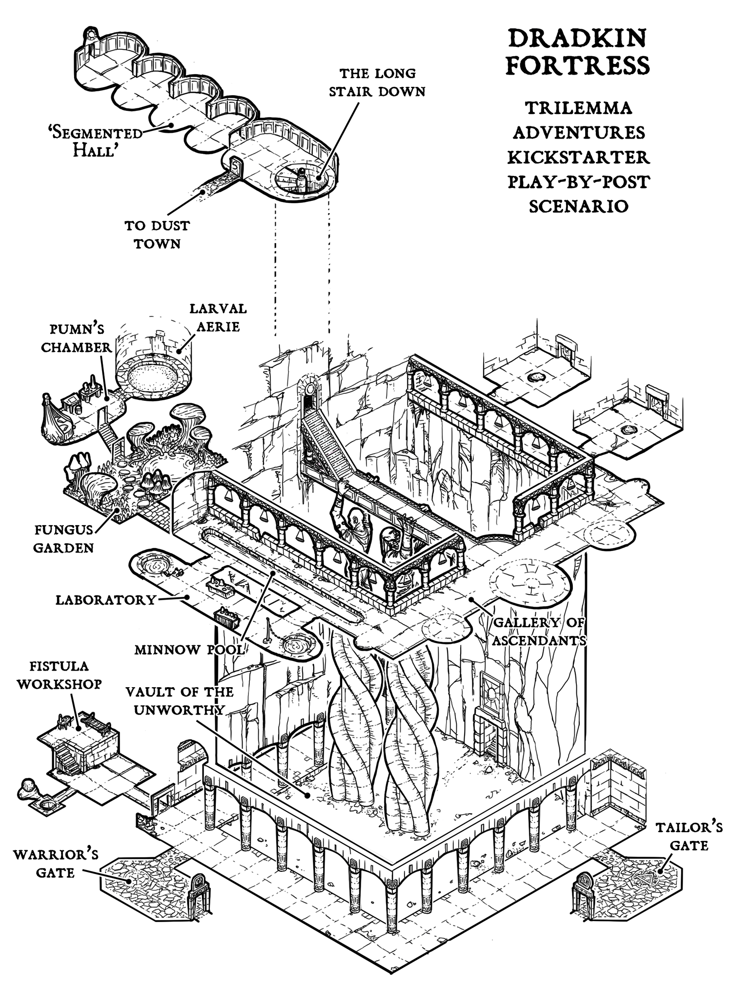
      ..and here is the complete map of the fortress—at least, the bits that the axewives are aware of so far.


      Wednesday, 15 May 2019

      Compendium Kickstarter News

      We've now reached the mid-way point of the Kickstarter campaign for the compendium. The fifth battle update went out this morning, showing the beginning of the Dradkin counter-attack plan.


      It's very bad news for the axewives of Grinvolt.

      On the 'book' front, layout is progressing very well, and I'm starting to fill in the spots I'd marked off for extra illustrations. You can see one here, down at the bottom of The Mermaids' Knot.


      Here's a detail WIP image of a Priestess of Suvuvena, greeting the adventurers. This one is by Juan Ochoa, who contributed the awesome Heelan warrior for Lair of the Lantern Worm! I saw the sketch of the whole image and I can't wait to see the whole thing.


      On May 30, the gate closes for good, and anyone not inside gets turned into chirpers. Any help you can offer, spreading the word to people you think would enjoy this compilation is much appreciated!

      Thursday, 9 May 2019

      $45k Kickstarter Unlock

      Things have been busy over on the Kickstarter. A surge of people pushed it up to $45,000 by today (day 8), and as I write there are 997 backers.. three short of a thousand people. (?!)

      The stretch goal that was unlocked today was a second gazetteer entry, this time for the south coast. Here, along a strip of rocky coastline are the ancestral lands of Grinvolt, stretching from the labyrinthine High Uttvelt all the way to slumbering Tealwood. In this entry: the hallowed stacks of Millvale, the speakers of the Talking Wood, and the crawling ghosts of Halet Girm!

      This means the book is now:
      • 48 adventures
      • A bestiary of 90+ monsters, with OSR stats in a companion PDF
      • A regional hex map
      • Four pages of regional gazetteer entries
      • A history appendix on the cultures, Seree magic, and the nature of the underworld
      The play-by-post mass battle against the Dradkin also took a surprising turn! The axewives picked a startling strategy to deal with a hideous monster:


      If you'd like to join in, please do!

      Thursday, 2 May 2019

      Smashing Stretch Goals

      The last 24 hours have been remarkable, smashing through six stretch goals. A bunch of people weighed in with their tactics for preparing for the battle.. and now it unfolds.


      If you feel like joining the battle, please do!

      Wednesday, 1 May 2019

      Trilemma Kickstarter is LIVE


      The wait is over, the horn has sounded! Grinvolt axewives are now pouring down the stairs to the Dradkin fortress. Who knows how far they will get, or what awaits them in the darkness?

      The Trilemma Adventures Compendium is now live on Kickstarter!

      What's in the Book?


      • 48 two-page adventures lovingly illustrated with isometric maps
      • Remastered for glorious landscape, revised and re-edited
      • Ten of the adventures get full-page expansions!
      • A detailed index of people, places, gods, and monsters
      • Adventure summaries for speedy selection on game night
      • Up to 45 pages of stretch goal content! (If we get there..)

      For all the details, click through to the Kickstarter page! Grinvolt needs you!

      Sunday, 28 April 2019

      Kickstarter Videos & Marketing

      A long time ago, I decided to make my adventure PDFs free. I believed that my content would do a better job at marketing itself than I could trying to sell people on something they couldn't see.

      (If you just wanna see the videos, scroll down to the bottom!)

      Running a Kickstarter challenges this approach. There's a defined funding period, and I need to get interested parties to the Kickstarter page within that period. Not before, and not after! This means actual marketing. Uh oh!

      Thanks to the workspace I'm sitting in these days, I'm getting some quick 'n' dirty mentoring in marketing. Yay serendipity!

      This has helped me understand that I need very different messages for different groups of people, which is a challenge with my limited manpower! I'd rather be drawing or writing. Surely you'd rather I was drawing or writing too!

      Different Dice for Different Mice

      For people who already know what I do (maybe you've downloaded, maybe played, or even supported me on Patreon), the message is, "It's happening now," and "tell your friends."

      Beyond this, there's a halo of people who kinda know what I'm doing, and may not know whether it's applicable to them. They might have seen my stuff or even played one at a con, but don't remember my name or my blog name. Or maybe they saw one but don't realize how big the collection is. Maybe they saw multiple pieces and didn't realize they were by the same person. (Branding fail.)

      For this group, the message has to start earlier in the awareness process. Yep, this is me, this is where you get them, and by the way.. now.

      Then there's are people who haven't heard of me, but would love my content. Maybe they weren't on G+ (my main stomping ground, may it rest in peace). This group needs awareness building, which is apparently time-consuming and expensive.

      In a way, I suppose you could view the last five years as exactly this sort of awareness building, a crazily slow word-of-mouth campaign for this book. In any case, it's a bit late to be energetically targeting this group at this point in time.

      Even so, I want to make sure that any messages they do see still work for them.

      The Call-to-Action Hydra

      The other complexity is the "call to action." Apparently, unless you're doing long-term brand awareness, marketing messaging needs to urge you to do something. The trick is, that something changes based on who I'm talking to and when I'm talking to them.

      I can put out a video spreading awareness of the Kickstarter before it starts, but unless people have a way of book marking their intention to become backers, it's easy to miss a 30-day window. That mechanism varies from place to place.

      Liking a Facebook page, following on Twitter, subscribe to my notification mailing list, add this to your blog roll, visit the Kickstarter page. All of these are different messages. That's not too bad in text, but it's way more labour intensive for video content.

      Add to all of this that I can't even send people to the Kickstarter page before it launches; there's nothing for them to do. That means on launch day, all my messaging needs to change. Fun times!

      Video Punchline

      Anyways, here's the punchline to all of this: two slightly different videos, one meant for pre-launch sharing, and another that sits on the Kickstarter page itself.

      I'm curious if you think they do the job - communicating what I'm doing, when, while engaging people who already know what I'm all about. Suitable for a possibly wide audience (in case I get a lot of reshares), but not so slick ad advertising-like that they alienate people who've been supporting me for a long time.

      Here's video one, the "pre-launch" video:


      Here's the video that gets embedded in the Kickstarter page itself. It's exactly the same for the first 90 seconds, but then has a different ending. (I obviously don't want to send people who are watching this on Kickstarter over to trilemma.com! Although the video might get shared outside of KS.. so I can't even take that for granted!)


      If any of this works and the Kickstarter is a success, when the dust has cleared I'll have to draw up my "communication map" that shows how it all fits together.

      b.r.b. drawing a communication map

      Wednesday, 24 April 2019

      Kickstarter Assault: The Stairs

      We're now in the one-week countdown for the Trilemma Adventures Compendium Kickstarter! During the campaign, I'll be running a dungeon assault scenario, where backers help direct the forces.

      As we count down the final seven days until launch, I'll be answering questions about the scenario, and using your input to direct Grinvolt's preparations.

      Preparations Begun

      Four preparations have begun so far:

      1. Quarter-Lord Counobel, commander of the Grinvolt garrison occupying the upper level of the Sun Temple, has sent word in three directions for reinforcements to join the attack.

      2. At Eamon's suggestion, , has started spreading false rumors word in Dust Town that he intends to abandon the garrison, in the hopes of misleading Dradkin spies.

      3. Over on MeWe, Thaddeus Moore directed several men-at-arms to gather great quantities of oily leaves and to make great, two-handed fans, in case a huge smoky fire was needed.

      4. Gathana, flametender and the garrison's priestess of Panur has decided to spend all of her time preparing a ritual of blinding light, which the Grinvolt axewives believe hurt Dradkin eyes.

      What Is Known

      Yesterday I got a question about Dradkin tactics, based on what Quarter-Lord Counobel observed during the battle.


      Today's question is about the staircase down to the Dradkin fortress. Here's what is known about those:

      1. The spiral stair down to the fortress is long, at least 200 steps.

      2. They are large, wide enough for two people to walk side-by-side. It's definitely wide enough for a boulder. (There are plenty outside that could be fetched, and hewn into a round-enough shape to be rolled down.)

      3. In the chaos of victory six years ago, three axewives descended on their own; they found a cavernous gallery, spanned by some sort of bridge. Only one returned, the other two were cut down by arrows, but their small lamp wasn't bright enough to illuminate the large chamber.

      4. Some axewives wanted to attack downwards, but Counobel ordered a halt. He argued that their task was to stop the raids, and the stairs were easy to defend. The Dradkin would soon be starved down in their claustrophobic mine!

      5. This was soon revealed as a false hope. The Dradkin showed no sign of surrender; the occasional breeze on the stairs suggested there are other ways out. (Though none have been found in the surrounding area.)

      6. Counobel maintains a guard post at the top. They keep a cauldron of hot oil on a bed of coals, with orders to pour it down if the Dradkin attack in force. At first the guards were in pairs, but as the Grinvolt numbers have dwindled, the duty is now a lonely one.

      7. It is common for the guards to report the sounds of Dradkin far below; occasional shouts, metal-on-stone clanking.

      8. The rumor among the camp followers in Dust Town is that some of the axewives have been bribed by the Dradkin for information, and may even have allowed spies. Counobel has dismissed this as unthinkable, but weird gems continue to show up in circulation. The story is always that yet another cache has been found behind the limestone wall panels.

      Monday, 22 April 2019

      Taking the Sun Temple

      Spwack asked a great question in the comments.

      "Has Counobel learnt anything about dradkin tactics from the first assault? Perhaps that might influence the final push to the last fortress."


      That's an excellent question! Here's what Counobel knows about Dradkin tactics:

      1. Dradkin don't seem to like daylight; raids on Grinvolt farms were always at night, and no scouts have been encountered in the day (though they may have been hiding).

      2. The approach to the Sun Temple itself was unimpeded. The entrance faces west, and the entry chamber lights up spectacularly at sunset. Gathana believes the Dradkin both revere and fear the blinding sun and the surface world in general.

      3. The upper level of the Sun Temple seems to be primarily a place of worship. Despite the raids they had launched on the surface from this complex, there were almost no warrior-caste Dradkin present at the time of the attack.

      4. The idea that there is a fortress below came from the few surviving/captured Dradkin. As described, the purpose of the fortress was to prevent attack from below, not from the surface. (The Dradkin view the complex as a sort of mountaintop monastery, a 'high altitude' place from their perspective.)

      5. The first Grinvolt casualties fell in the round chamber. They were ignored in the first moments of the assault, but when they were checked later, they had no visible wounds, but their skin was crusted with salt. Common belief is they were stricken by a curse, but the warriors don't like to talk about it.

      6. The area that is now a barracks was occupied by half-starved Dradkin, who put up little resistance. The area was either a prison, monastic cells for penitents, or some combination of the two. Wall engravings imply that surviving on scarce food is a moral virtue among Dradkin.

      7. "Dust Town" (apparently a mine) was fully equipped with tools for digging through the loose, gravelly coprolith, but it seems to have been inactive at the time of the attack.

      8. The Dradkin put up a good fight in the Night Temple, owing to the twisty entrance. The score of Dradkin there were armed only with knives and long sticks, (and no armor over their leather garments), but they used the choke point effectively, barricading it with a stone pew.

      After a five-minute stalemate of violent shoving and stabbing, the Dradkin allowed a small number of Grinvolt axewives to slip into the chamber, only to topple a second stone pew in front of the entrance. The exhausted axewives were killed before the rest of the attackers could dislodge the barricade.

      Once that happened, the Dradkin line broke and they were cut down both there, and in what are now Gathana's workrooms.

      9. The most difficult fight was in the segmented hallway leading to stairs downward, against a group of eleven Dradkin, apparently heavy infantry trained in close-ranked fighting.

      The Dradkin infantry had what later became known as tomb shields: heavy tower shields with a low step for the user to obtain a small height advantage. The Dradkin blocked the corridor with a fan of tomb shields, trying to buy time for a small number of reinforcements to arrive from below.

      Grinvolt had little experience with close-ranked siege fighting, being more used to intra-clan warfare involving longboat raids: loose-formation fights and ambushes with spear, axe, and sling. They were unprepared for the wall of tomb shields, and retreated when the Dradkin second rank opened up with heavy crossbows.

      In an apparent tactical mistake, the Dradkin pursued, abandoning their shields. Counobel believes the Dradkin did this because they didn't realize there were so many enemies present in the complex, and thought they had routed a small group of raiders.

      The Dradkin infantry made it to the central chamber, but immediately found themselves flanked by axewives coming south from the Night Temple (where the fighting was now done). They made a stand there, and killed 6 axewives before they were themselves killed.

      10. Dradkin infantry wear scale-like armor made from chips of bone and metal, sewn onto a three-layered leather vest. (Dradkin seem to use no woven cloth.) The armor is tied on from the back with leather ties, and several of the Dradkin' vests were not tied in their haste to ascend the long stair and retake the Sun Temple.

      They were armed with short, spear-like weapons, only a pace and a half long: a wide, stabbing blade affixed to long, bone handle.

      11. Tomb shields are as tall as a man, but only a pace in width, and notched to interlock with other shields on either side. They are made of layers of tough fungus, matted together with pitch or resin. Axes cut into them easily, but are likely to get stuck.

      Gathana said that the runes on the exterior of the shields were cursed, and would entomb the souls of any who died in front of them (hence the name). She transcribed the runes, then ordered them all burned outside.

      Sunday, 21 April 2019

      Kickstarter Scenario: Assault

      As I mentioned, I'm Kickstarting a compendium of my adventures on May 1. I thought we'd have a little fun while it's running: an all-out assault on a dradkin fortress. We'll resolve it during the campaign, a crowd-sourced dungeon battle!

      The Scenario

      In a Patron-only adventure, "A Clutch of Shadows," I laid out the scenario of a garrison of Grinvolt axewives and men-at-arms, occupying an underground Dradkin 'sun temple'.

      The temple is a gateway to the underworld, and has been the source of raids on Grinvolt lands for decades. In a rare display of cohesion, the Grinvolt clans came together to assault it. They surprised the Dradkin, and although they lost many brave warriors, they managed to seize the upper level of the complex.

      For the six years since the original attack, Quarter-Lord Counobel has kept a precarious grip on the complex. The morale of the occupiers has faded, and now with the Sun Temple's treasures carted away, so has foreign interest and the money that it brought. Grinvolt songs don't sound so cheery underground, and the echoes of glory won't bring food to the tables. Many have drifted away, returning to their fishing boats and goat pens.


      Unfortunately, the Dradkin threat is not gone. Leading down from the Sun Temple is a long, narrow stair, leading to a Dradkin fortress—still occupied by the Dradkin. They have spent the years preparing for a counter-attack. Dradkin spies move among the camp fires of dust town, learning the weaknesses of the occupiers.

      Meanwhile other, more horrible preparations are being made below.

      Gathana, garrison's flametender seems lost in her research into Dradkin runes and offers no counsel, but Counobel knows in his bones that the garrison's days are numbered. If it falls, all the lives that were spent securing the Sun Temple will have been for nothing, and Dradkin will once more raid the surface with impunity.

      He makes a fateful plan: he will spend the last of his influence on a summons, calling back every warrior willing to return to the darkness. When they have assembled, they attack the fortress below.

      The Fortress Revealed

      When the Kickstarter launches on May 1, I will describe the opening moments of the attack, and reveal a new isometric map, showing the first chambers of the Dradkin fortress!

      Every time a campaign stretch goal milestone goal is hit, I will reveal another section of the Dradkin fortress, and describe the progress of the battle.

      How the Grinvolt warriors carry out their attack is up to you. During the Kickstarter campaign, I'll be running polls and taking feedback in the comments. What orders does Counobel give? Surface warriors need to use their brains to defeat prepared soldiers of the underworld on their home turf. Six years ago, Grinvolt defeated an unprepared enemy. It won't be as easy this time.

      Adventure Location: Aftermath

      Counobel's attack may succeed, but it could also fail tragically. Either way, if the right stretch goal is hit, I will take the revealed map and write it up as a new adventure location to be included in the compendium.

      The adventure will describe the dradkin fortress in the aftermath of the attack. The battle itself will belong only to those of you involved during the Kickstarter campaign, but whatever happens will leave a legacy for others to explore in play.

      The Forces of Grinvolt

      Right now, it's ten days before the Kickstarter—ten days before Counobel orders the attack. Here is the disposition of the surface forces:

      • Counobel, Quarter-Lord of Grinvolt and commander of the garrison
      • Gathana, flametender and priestess of Panur
      • 18 axewives (one disgraced) and their families
      • 11 men-at-arms, half with families
      As well, about a hundred camp followers live within the complex (most of them in 'Dust Town'). The garrison has been faming the lands surrounding the sun temple. The soil is rocky and ill-suited to the clans' traditional crops, but another hundred non-combatants live outside in a slowly growing.

      Counobel sent out three messengers a month ago:
      • His cousin sailed to Halet Girm with the last of the silver, and is returning with two longboats and 15 men-at-arms.
      • Akum went north into Haverlow, but drank from an ill-fated pond and has lost his senses.
      • Counobel's daughter Rolan went northeast to Grinvolt. She secured oaths from 13 axewives that they would join the attack. She then decided press further. She found none in Slumbering Tealwood, but two days ago she reached the pass at Splitpeak. As I write this, she can smell the smoke from High Kellan.

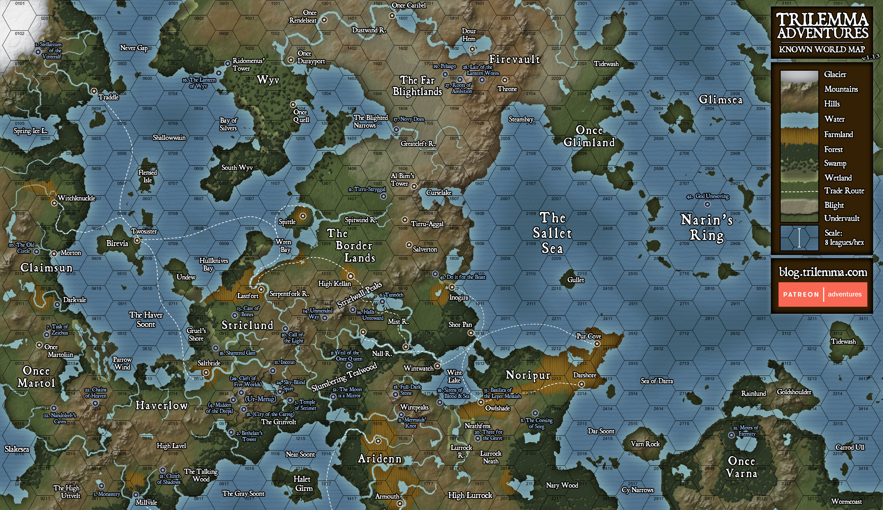
      (The Sun Temple is in hex 0716, on the south edge of the map.)

      Final Preparations

      With ten days left, what preparations should Counobel command? Will the axes of the Grinvolt warriors be enough, or should they concoct some other scheme for fighting in the cramped tunnels? Should he send a scout down below, or will that risk a counter-attack before he's ready?

      Put your thoughts in the comments!